Brightness Screen Widget Configuration
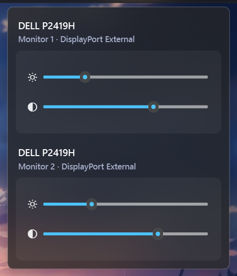
Displays your screen's brightness level and lets you adjust it on the fly. You can change brightness by scrolling your mouse wheel, click to cycle through set levels, and set up a timer to auto-adjust for day and night. It also supports an interactive menu where you can control the brightness and contrast of all your connected monitors at once.
| Option | Type | Default | Description |
|---|---|---|---|
label |
string | "{icon}" |
The format string for the brightness widget. |
label_alt |
string | "Brightness {percent}%" |
The alternative format string for the brightness widget. |
tooltip |
boolean | True |
Whether to show the tooltip on hover. |
scroll_step |
integer | 1 |
The step size for scrolling the brightness level. This value must be between 1 and 100. |
brightness_icons |
list | ['\udb80\udcde', '\udb80\udcdd', '\udb80\udcdf', '\udb80\udce0'] |
A list of icons representing different brightness levels. The icons are used based on the current brightness percentage. |
hide_unsupported |
boolean | True |
Whether to hide the widget if the current system does not support brightness control. |
brightness_toggle_level |
list | [0, 50, 100] |
The brightness levels to cycle through when the widget is clicked. |
auto_light |
boolean | False |
Whether to automatically adjust the brightness icon based on the current brightness level. |
auto_light_icon |
string | "\udb80\udce1" |
The icon to use when the auto_light option is enabled. |
auto_light_night_level |
int | 50 |
The brightness level at which the widget switches to the night. |
auto_light_day_level |
int | 100 |
The brightness level at which the widget switches to the day. |
auto_light_night_start_time |
string | "20:00" |
The time at which the night starts. |
auto_light_night_end_time |
string | "06:30" |
The time at which the night ends. |
brightness_menu |
dict | {'blur': True, 'round_corners': True, 'round_corners_type': 'normal', 'border_color': 'System', 'alignment': 'right', 'direction': 'down', 'offset_top': 6, 'offset_left': 0, 'brightness_icon': '\ue706', 'contrast_icon': '\ue7a1'} |
Menu settings for the widget. |
callbacks |
dict | {'on_left': 'toggle_label', 'on_middle': 'do_nothing', 'on_right': 'do_nothing'} |
Callbacks for mouse events on the brightness widget. |
progress_bar |
dict | {'enabled': false, 'progress_type': 'circular', 'position': 'left', 'size': 18, 'thickness': 3, 'color': '#00C800', 'background_color': '#3C3C3C', 'animation': true} |
Progress bar settings. |
| ## Example Configuration |
  brightness:
    type: "yasb.brightness.BrightnessWidget"
    options:
      label: "<span>{icon}</span>"
      label_alt: "Brightness {percent}%"
      tooltip: true
      hide_unsupported: true
      brightness_toggle_level: [0, 50, 100]
      auto_light: false
      auto_light_icon: "\udb80\udce1"
      auto_light_night_level: 35
      auto_light_night_start_time: "19:00"
      auto_light_night_end_time: "06:45"
      auto_light_day_level: 75
      brightness_icons: [
        "\udb80\udcde",  # Icon for 0-25% brightness
        "\udb80\udcdd",  # Icon for 26-50% brightness
        "\udb80\udcdf",  # Icon for 51-75% brightness
        "\udb80\udce0"   # Icon for 76-100% brightness
      ]
      brightness_menu:
        blur: true
        round_corners: true
        round_corners_type: "normal"
        border_color: "System"
        alignment: "right"
        direction: "down"
        brightness_icon: "\ue706"
        contrast_icon: "\ue7a1"
      callbacks:
        on_left: "toggle_brightness_menu"
        on_right: "toggle_label"
Description of Options
- label: The format string for the label. You can use placeholders like
{icon}or{percent}to dynamically insert information. - label_alt: The alternative format string for the brightness widget. Useful for displaying additional information like percentage.
- tooltip: Whether to show the tooltip on hover.
- scroll_step: The step size for scrolling the brightness level. This value must be between 1 and 100.
- brightness_icons: A list of icons representing different brightness levels. The icons are used based on the current brightness percentage.
- hide_unsupported: Whether to hide the widget if the current system does not support brightness control.
- brightness_toggle_level: The brightness level to set when the widget is clicked.
- brightness_menu: A dictionary specifying the menu settings for the widget. It contains the following keys:
- blur: Enable blur effect for the menu.
- round_corners: Enable round corners for the menu (this option is not supported on Windows 10).
- round_corners_type: Set the type of round corners for the menu (normal, small) (this option is not supported on Windows 10).
- border_color: Set the border color for the menu (this option is not supported on Windows 10).
- alignment: Set the alignment of the menu (left, right).
- direction: Set the direction of the menu (up, down).
- offset_top: Set the top offset of the menu.
- offset_left: Set the left offset of the menu.
- brightness_icon: The icon to use for the brightness slider in the menu.
- contrast_icon: The icon to use for the contrast slider in the menu.
- auto_light: Whether to automatically adjust the brightness icon based on the current brightness level.
- auto_light_icon: The icon to use when the auto_light option is enabled.
- auto_light_night_level: The brightness level at which the widget switches to the night.
- auto_light_day_level: The brightness level at which the widget switches to the day.
- auto_light_night_start_time: The time at which the night starts.
- auto_light_night_end_time: The time at which the night ends.
- callbacks: Callbacks for mouse events on the brightness widget. can be
toggle_brightness_menu,toggle_label,toggle_level_next,toggle_level_prev,do_nothing. - progress_bar: A dictionary containing settings for the progress bar. It includes:
- enabled: Whether the progress bar is enabled.
- progress_type: The type of progress bar. Options are
"circular","linear_horizontal", or"linear_vertical". - position: The position of the progress bar, either "left" or "right".
- size: The length of the progress bar (or diameter if circular). Minimum is 1, maximum is 200.
- thickness: The thickness of the progress bar. Minimum is 1, maximum is 100.
- radius: The border radius for the linear progress bar corners. Minimum is 0, maximum is 100.
- color: The color of the progress bar. Color can be a single color or a gradient. For example,
color: "#57948a"orcolor: ["#57948a", "#ff0000"]for a gradient. - background_color: The background color of the progress bar.
- animation: Whether to enable smooth change of the progress bar value.
Example Style
.brightness-widget {}
.brightness-widget .widget-container {}
.brightness-widget .widget-container .label {}
.brightness-widget .widget-container .icon {}
Style for the brightness popup menu
.brightness-menu {
    background-color: rgba(36, 36, 36, 0.75);
    min-width: 300px;
}
/* Grouping for monitor rows including title and sliders */
.brightness-menu .monitor-row {
    background-color: rgba(139, 69, 19, 0);
    margin: 12px;
}
/*
.monitor-0 is indexed as the first monitor row,
adjust if you have multiple monitors and want to style them differently correctly.
*/
.brightness-menu .monitor-row.monitor-0 {
    margin-bottom: 0;
}
.brightness-menu .monitor-title  {
    font-size: 13px;
    font-weight: 600;
    color: #ffffff;
    margin-top: 4px;
}
.brightness-menu .monitor-subtitle {
    font-size: 11px;
    color: #a6adc8;
    margin-top: 2px;
    margin-bottom: 8px;
}
/* Container for the sliders to create a grouped appearance including icons and sliders */
.brightness-menu .slider-rows {
    background-color: rgba(255, 255, 255, 0.05);
    border-radius: 8px;
    padding: 16px;
}
.brightness-menu .slider-icon {
    font-family: "Segoe Fluent Icons";
}
.brightness-menu .slider-row {
    margin: 4px 0;
    padding: 8px 0px;
}
/* optional styles for the brightness and contrast sliders */
.brightness-slider::groove {}
.contrast-slider::groove {}
.brightness-slider::handle{}
.contrast-slider::handle{}

/* Brightness progress bar styles if enabled */
.brightness-widget .progress-container {}
Preview of the Widget