Pomodoro Timer Widget
This widget implements a Pomodoro timer, which is a time management method that uses a timer to break work into intervals, traditionally 25 minutes in length, separated by short breaks. The Pomodoro Technique is designed to improve focus and productivity.
| Option | Type | Default | Description |
|---|---|---|---|
label |
string | \uf252 {remaining} |
The label format for displaying timer information. |
label_alt |
string | {session}/{total_sessions} - {remaining} |
Alternative label format that can be toggled. |
class_name |
string | "" |
Additional CSS class name for the widget. |
work_duration |
integer | 25 |
The duration of work sessions in minutes. |
break_duration |
integer | 5 |
The duration of regular breaks in minutes. |
long_break_duration |
integer | 15 |
The duration of long breaks in minutes. |
long_break_interval |
integer | 4 |
Number of work sessions before a long break. |
auto_start_breaks |
boolean | true |
Automatically start break timer after work session ends. |
auto_start_work |
boolean | true |
Automatically start work timer after break ends. |
sound_notification |
boolean | true |
Play sound when a timer finishes. |
show_notification |
boolean | true |
Show Windows notification when a timer finishes. |
session_target |
integer | 0 |
Target number of sessions (0 means unlimited). |
hide_on_break |
boolean | false |
Hide the widget during break sessions. |
icons |
dict | See below | Icons used for different timer states. |
callbacks |
dict | See below | Configure widget interaction callbacks. |
menu |
dict | See below | Configure the appearance and behavior of the timer menu. |
progress_bar |
dict | {'enabled': false, 'progress_type': 'circular', 'position': 'left', 'size': 18, 'thickness': 3, 'radius': 0, 'color': '#00C800', 'background_color': '#3C3C3C', 'animation': true} |
Progress bar settings. |
Example Configuration
pomodoro:
  type: "yasb.pomodoro.PomodoroWidget"
  options:
    label: "<span>{icon}</span> {remaining}"
    label_alt: "<span>{icon}</span> {session}/{total_sessions} - {status}"
    work_duration: 25
    break_duration: 5
    long_break_duration: 15
    long_break_interval: 4
    auto_start_breaks: true
    auto_start_work: true
    sound_notification: true
    show_notification: true
    hide_on_break: false
    session_target: 8
    icons:
      work: "\uf252"
      break: "\uf253"
      paused: "\uf254"
    menu:
      blur: true
      round_corners: true
      round_corners_type: "normal"
      border_color: "System"
      alignment: "right"
      direction: "down"
      offset_top: 6
      offset_left: 0
      circle_background_color: "#09ffffff"
      circle_work_progress_color: "#88c0d0"
      circle_break_progress_color: "#a3be8c"
      circle_thickness: 8
      circle_size: 160
    callbacks:
      on_left: "toggle_menu"
      on_middle: "reset_timer"
      on_right: "toggle_label"
Description of Options
- label: Format for displaying timer information. Available variables:
{remaining},{elapsed},{session},{total_sessions},{status},{icon}. {remaining}- Time left in the current phase (work or break), counting down. Example:24:15{elapsed}- Total accumulated work time across all completed sessions plus the current work session progress. Break time is excluded. Holds steady during breaks. Example: after 2 full 25-min sessions and 10 min into the 3rd →01:00:00{session}- Current session number (1-based).{total_sessions}- Target number of sessions, or∞if unlimited (session_target: 0).{status}- Current timer state:Work,Break, orPaused.{icon}- Icon for the current state, as configured in theiconsoption.- label_alt: Alternative label format that can be toggled with right-click (or configured callback). Supports the same variables as
label. - class_name: Additional CSS class name for the widget. This allows for custom styling.
- work_duration: The duration of work sessions in minutes.
- break_duration: The duration of regular breaks in minutes.
- long_break_duration: The duration of long breaks in minutes.
- long_break_interval: Number of work sessions before taking a long break.
- auto_start_breaks: Automatically start break timer when work session ends.
- auto_start_work: Automatically start work timer when break ends.
- sound_notification: Play a sound notification when timer finishes.
- show_notification: Display a Windows notification when timer finishes.
- session_target: Target number of completed sessions (0 means unlimited).
- hide_on_break: Hide the widget during break sessions.
- icons: Customize icons used for different timer states.
- work: Icon for work sessions.
- break: Icon for break sessions.
- paused: Icon for paused timer.
- callbacks: Configure what happens when clicking the widget.
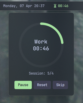
- menu: Configure the appearance and behavior of the timer menu including the circular progress indicator.
- blur: Whether to enable blur effect.
- round_corners: Whether to round corners.
- round_corners_type: Type of rounding ("Normal", "Small").
- border_color: Border color ("System", None, "Hex Color").
- alignment: Alignment of the menu (left, right, center).
- direction: Direction of the menu (up, down).
- offset_top: Top offset for the menu.
- offset_left: Left offset for the menu.
- circle_background_color: Background color of the circular progress indicator.
- circle_work_progress_color: Color of the work progress in the circular indicator.
- circle_break_progress_color: Color of the break progress in the circular indicator.
- circle_thickness: Thickness of the circular progress indicator.
- progress_bar: A dictionary containing settings for the progress bar. It includes:
- enabled: Whether the progress bar is enabled.
- progress_type: The type of progress bar. Options are
"circular","linear_horizontal", or"linear_vertical". - position: The position of the progress bar, either "left" or "right".
- size: The length of the progress bar (or diameter if circular). Minimum is 1, maximum is 200.
- thickness: The thickness of the progress bar. Minimum is 1, maximum is 100.
- radius: The border radius for the linear progress bar corners. Minimum is 0, maximum is 100.
- color: The color of the progress bar. Color can be a single color or a gradient. For example,
color: "#57948a"orcolor: ["#57948a", "#ff0000"]for a gradient. - background_color: The background color of the progress bar.
- animation: Whether to enable smooth change of the progress bar value.
Available Callbacks
- toggle_timer: Start or pause the timer.
- reset_timer: Reset the current timer.
- toggle_label: Switch between main and alternative label format.
- toggle_menu: Show the timer management menu.
Available Style
.pomodoro-widget {} /*Style for widget.*/
.pomodoro-widget.your_class {} /* If you are using class_name option */
.pomodoro-widget .widget-container {} /*Style for widget container.*/
.pomodoro-widget .label {} /*Style for label.*/
.pomodoro-widget .icon {} /*Style for icon.*/
.pomodoro-widget .label.paused {} /*Style for label when timer is paused.*/
.pomodoro-widget .label.work {} /*Style for label during work sessions.*/
.pomodoro-widget .label.break {} /*Style for label during breaks.*/
.pomodoro-widget .icon.paused {} /*Style for icon when timer is paused.*/
.pomodoro-widget .icon.work {} /*Style for icon during work sessions.*/
.pomodoro-widget .icon.break {} /*Style for icon during breaks.*/
/* Pomodoro menu */
.pomodoro-menu {} /*Style for menu background.*/
.pomodoro-menu .header {} /*Style for menu header.*/
.pomodoro-menu .status {} /*Style for status text.*/
.pomodoro-menu .session {} /*Style for session counter.*/
.pomodoro-menu .button {} /*Style for buttons.*/
.pomodoro-menu .button.start {} /*Style for start button.*/
.pomodoro-menu .button.reset {} /*Style for reset button.*/
.pomodoro-menu .button.pause {} /*Style for pause button.*/
.pomodoro-menu .button:hover {} /*Style for button hover effect.*/
.pomodoro-menu .button:pressed {} /*Style for button pressed effect.*/

/* Pomodoro progress bar styles if enabled */
.pomodoro-widget .progress-container {}
Example CSS
.pomodoro-widget {
    padding: 0 6px 0 6px;
}
.pomodoro-widget .icon {
    font-size: 12px;
    padding-right: 4px;
}
.pomodoro-widget .label.paused,
.pomodoro-widget .icon.paused {
    color: #7d7e8b;
}
.pomodoro-widget .label.work,
.pomodoro-widget .icon.work {
    color: #a6e3a1;
}
.pomodoro-widget .label.break,
.pomodoro-widget .icon.break {
    color: #89b4fa;
}
/* Pomodoro menu styling */
.pomodoro-menu {
    background-color: rgba(17, 17, 27, 0.2);
    border-radius: 8px;
}
.pomodoro-menu .header {
    font-size: 16px;
    font-weight: 600;
    max-height: 0px;
    color: #ffffff;
}
.pomodoro-menu .status {
    font-size: 18px;
    font-weight: 600;
    color: #cdd6f4;
}
.pomodoro-menu .session {
    font-size: 12px;
    color: #a6adc8;
}
.pomodoro-menu .button {
    background-color: #3f4053;
    color: #cdd6f4;
    border: none;
    border-radius: 4px;
    padding: 6px 12px;
}
.pomodoro-menu .button.start {
    background-color: #3f4053;
}
.pomodoro-menu .button.reset {
    background-color: #3f4053;
}
.pomodoro-menu .button:hover {
    background-color: rgba(255, 255, 255, 0.158);
}
.pomodoro-menu .button.pause {
    background-color: #a6e3a1;
    color: #1e1e2e;
}
.pomodoro-menu .button:pressed {
    background-color: #5a5b6e;
}
Preview of the Widget