Volume Widget Options
Displays your speaker volume and mute status. You can adjust the volume by scrolling your mouse wheel, click to mute/unmute, and open a popup menu to switch audio devices, manage app-specific volumes, and open sound settings.
| Option | Type | Default | Description |
|---|---|---|---|
label |
string | '{level}' |
The format string for the volume label. You can use {icon} for the volume icon and {level} for the volume percentage. |
label_alt |
string | '{level}' |
The alternative format string for the volume label. Useful for displaying additional volume details. |
class_name |
string | "" |
Additional CSS class name for the widget. |
scroll_step |
int | 2 |
The step size for volume adjustment when scrolling. The value is in percentage points (0-100). |
slider_beep |
boolean | true |
Whether to play a sound when the volume slider is released. |
mute_text |
string | 'mute' |
Text used by {level} to indicate muted volume |
tooltip |
boolean | true |
Whether to show the tooltip on hover. |
icons |
dict | {'muted': '\ueee8', '10': '\uf026', '30': '\uf027', '60': '\uf027', '100': '\uf028'} |
A dictionary of icons representing different volume levels. The icons are used based on the current volume percentage. |
callbacks |
dict | {'on_left': 'toggle_volume_menu', 'on_middle': 'do_nothing', 'on_right': 'toggle_mute'} |
Callbacks for mouse events on the volume widget. |
audio_menu |
dict | See below | Menu settings for the widget. |
progress_bar |
dict | {'enabled': false, 'progress_type': 'circular', 'position': 'left', 'size': 18, 'thickness': 3, 'radius': 0, 'color': '#00C800', 'background_color': '#3C3C3C', 'animation': true} |
Progress bar settings. |
Example Configuration
volume:
  type: "yasb.volume.VolumeWidget"
  options:
    label: "<span>{icon}</span> {level}"
    label_alt: "{level}"
    icons:
      "muted": "\ueee8" # Icon for muted
      "10": "\uf026"  # Icon for 0-10% volume
      "30": "\uf027"  # Icon for 11-30% volume
      "60": "\uf027"  # Icon for 31-60% volume
      "100": "\uf028" # Icon for 61-100% volume
    audio_menu:
      blur: true
      round_corners: true
      round_corners_type: "normal"
      border_color: "system"
      alignment: "right"
      direction: "down"
    callbacks:
      on_left: "toggle_volume_menu"
      on_right: "toggle_mute"
Audio Menu Options
    audio_menu:
      blur: true # Enable blur effect for the menu
      round_corners: true # Enable round corners for the menu (not supported on Windows 10)
      round_corners_type: "normal" # Set the type of round corners for the menu (normal, small) (not supported on Windows 10)
      border_color: "system" # Set the border color for the menu, "system", Hex color or None
      alignment: "right" # Set the alignment of the menu (left, right, center)
      direction: "down" # Set the direction of the menu (up, down)
      offset_top: 6 # Set the top offset of the menu
      offset_left: 0 # Set the left offset of the menu
      show_apps: true # Whether to show the list of applications with audio sessions
      show_app_labels: false # Whether to show application labels in the audio menu
      show_app_icons: true # Whether to show application icons in the audio menu
      show_apps_expanded: false # Whether application volumes are expanded by default when opening the menu
      app_icons: # Icons for the toggle button to expand/collapse application volumes
        toggle_down: "\uf078" # Icon for btn collapsed state
        toggle_up: "\uf077" # Icon for btn expanded state
Description of Options
- label: The format string for the volume label. Available placeholders are
{icon}for the volume icon and{level}for the volume percentage or muted text. - label_alt: The alternative format string for the volume label. Useful for displaying additional volume details.
- class_name: Additional CSS class name for the widget. This allows for custom styling.
- mute_text: The text for
{level}to display when the volume is muted. Default: "mute". - tooltip: Whether to show the tooltip on hover.
- scroll_step: The step size for volume adjustment when scrolling. The value is in percentage points (0-100).
- slider_beep: Whether to play a sound when the volume slider is released.
- icons: A dictionary of icons representing different volume levels. The dictionary keys must be strings representing the upper bound volume limit (e.g.
"10","30"). You can map"muted"to a specific icon. Example:{"muted": "...", "10": "...", "100": "..."}. The icons are used based on the current volume percentage. For example, if the volume is at 25%, the widget will use the icon mapped to"30"since 25% is less than or equal to 30. - audio_menu: A dictionary specifying the menu settings for the widget. It contains the following keys:
- blur: Enable blur effect for the menu.
- round_corners: Enable round corners for the menu (this option is not supported on Windows 10).
- round_corners_type: Set the type of round corners for the menu (normal, small) (this option is not supported on Windows 10).
- border_color: Set the border color for the menu (this option is not supported on Windows 10).
- alignment: Set the alignment of the menu (left, right).
- direction: Set the direction of the menu (up, down).
- offset_top: Set the top offset of the menu.
- offset_left: Set the left offset of the menu.
- show_apps: Whether to show the list of applications with audio sessions.
- show_app_labels: Whether to show application labels in the audio menu.
- show_app_icons: Whether to show application icons in the audio menu.
- show_apps_expanded: Whether application volumes are expanded by default when opening the menu. When set to
true, the application volume sliders will be visible immediately when the menu opens. When set tofalse(default), they remain collapsed until the toggle button is clicked. - app_icons: A dictionary specifying icons for the toggle button to expand/collapse application volumes. It contains the following keys:
- toggle_down: Icon for the button in the collapsed state.
- toggle_up: Icon for the button in the expanded state.
- callbacks: A dictionary specifying the callbacks for mouse events. The keys are
on_left,on_middle, andon_right, and the values are the names of the callback functions. - progress_bar: A dictionary containing settings for the progress bar. It includes:
- enabled: Whether the progress bar is enabled.
- progress_type: The type of progress bar. Options are
"circular","linear_horizontal", or"linear_vertical". - position: The position of the progress bar, either "left" or "right".
- size: The length of the progress bar (or diameter if circular). Minimum is 1, maximum is 200.
- thickness: The thickness of the progress bar. Minimum is 1, maximum is 100.
- radius: The border radius for the linear progress bar corners. Minimum is 0, maximum is 100.
- color: The color of the progress bar. Color can be a single color or a gradient. For example,
color: "#57948a"orcolor: ["#57948a", "#ff0000"]for a gradient. - background_color: The background color of the progress bar.
- animation: Whether to enable smooth change of the progress bar value.
Available Styles
.volume-widget {}
.volume-widget.your_class {} /* If you are using class_name option */
.volume-widget .widget-container {}
.volume-widget .label {}
.volume-widget .label.alt {}
.volume-widget .icon {}
.volume-widget .label.muted {} /* Applied when audio is muted */
.volume-widget .icon.muted {} /* Applied when audio is muted */
.volume-widget .label.no-device {} /* Applied when no audio device is connected */
.volume-widget .icon.no-device {} /* Applied when no audio device is connected */
/* Volume progress bar styles if enabled */
.volume-widget .progress-container {}
/* Audio menu styles */
.volume-widget .audio-menu {}
/* System volume */
.audio-menu .system-volume-container .volume-slider {}
.audio-menu .system-volume-container .volume-slider::groove {}
.audio-menu .system-volume-container .volume-slider::handle{}
/* Device list styles */
.audio-menu .audio-container .device {}
.audio-menu .audio-container .device.selected {}
.audio-menu .audio-container .device:hover {}
/* Toggle button for application volumes (if is enabled) */
.audio-menu .toggle-apps {}
.audio-menu .toggle-apps.expanded {}
.audio-menu .toggle-apps:hover {}
/* Container for application volumes (if is enabled) */
.audio-menu .apps-container {} /* Individual application volume container */
.audio-menu .apps-container .app-volume {} /* Individual application volume container */
.audio-menu .apps-container .app-volume:hover {}
.audio-menu .apps-container .app-volume .app-label {} /* Application label */
.audio-menu .apps-container .app-volume .app-icon-container .app-icon {} /* Application icon */
.audio-menu .apps-container .app-volume .app-slider {} /* Application volume slider */
Example Styles
.volume-widget .icon {
    color: #74b0ff;;
    margin:0 2px 0 0;
}
.audio-menu {
    background-color:rgba(17, 17, 27, 0.4);
    min-width: 300px;
}
/* System volume */
.audio-menu .system-volume-container .volume-slider {
    border: none;
}
/* Device list styles */
.audio-menu .audio-container .device {
    background-color:transparent;
    border: none;
    padding:6px 8px 6px 4px;
    margin: 2px 0;
    font-size: 12px;
    border-radius: 4px;
}
.audio-menu .audio-container .device.selected {
    background-color: rgba(255, 255, 255, 0.085);

}
.audio-menu .audio-container .device:hover {
    background-color: rgba(255, 255, 255, 0.06);
}
/* Toggle button for application volumes (if is enabled) */
.audio-menu .toggle-apps {
    background-color: transparent;
    border: none;
    padding: 0;
    margin: 0;
    min-height: 24px;
    min-width: 24px;
    border-radius: 4px;
}
.audio-menu .toggle-apps.expanded {
    background-color: rgba(255, 255, 255, 0.1);
}
.audio-menu .toggle-apps:hover {
    background-color: rgba(255, 255, 255, 0.15);

}
/* Container for application volumes (if is enabled) */
.audio-menu .apps-container {
    padding: 8px;
    margin-top:20px;
    border-radius: 8px;
    background-color:rgba(255, 255, 255, 0.062)
}
.audio-menu .apps-container .app-volume .app-icon-container {
    min-width: 40px;
    min-height: 40px;
    max-width: 40px;
    max-height: 40px;
    border-radius: 6px;
    margin-right: 8px;
}
.audio-menu .apps-container .app-volume .app-icon-container:hover {
    background-color: rgba(255, 255, 255, 0.1);
}
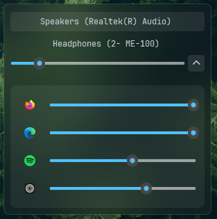
Preview of the Widget