WHKD Widget Options
Whkd is a simple hotkey daemon for Windows that reacts to input events by executing commands. More information can be found here.
| Option | Type | Default | Description |
|---|---|---|---|
label |
string | "\uf11c" |
The string for the label button. |
special_keys |
list | None |
A list of special keys to be used as hotkeys. |
Callbacks
| Callback | Description |
|---|---|
open_popup |
Opens the whkd shortcuts list window |
Example Configuration
  whkd:
    type: "yasb.whkd.WhkdWidget"
    options:
      label: "<span>\uf11c</span>"
      special_keys:
        - key: "win"
          key_replace: "\ue70f"
        - key: "ctrl"
          key_replace: "Ctrl"
        - key: "alt"
          key_replace: "Alt"
        - key: "shift"
          key_replace: "Shift"
        - key: "left"
          key_replace: "\u2190"
        - key: "right"
          key_replace: "\u2192"
        - key: "up"
          key_replace: "\u2191"
        - key: "down"
          key_replace: "\u2193"
Description of Options
- label: The string for the label button.
- special_keys: A list of special keys to be used as hotkeys. The list contains dictionaries with two keys:
keyandkey_replace. Thekeyis the special key to be used as a hotkey and thekey_replaceis the string to replace the special key with. - key: The special key to be used as a hotkey.
- key_replace: The string to replace the special key with.
Note
The special keys are keys which you can style and replace with custom icons. Special keys settings are optional. If you don't want to use special keys, you can leave the special_keys option empty.
Note
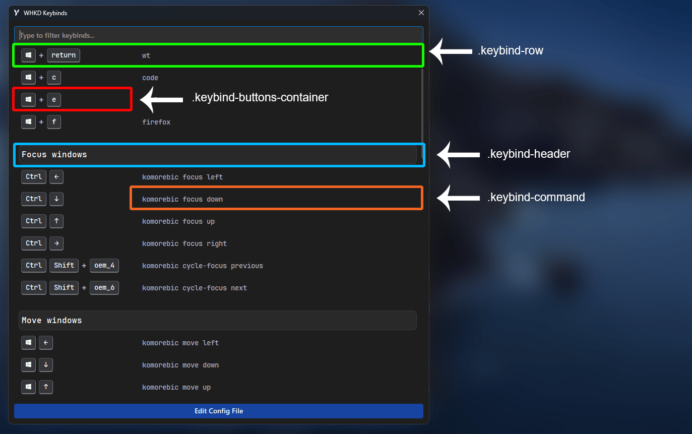
To use header like on screenshot below, you need to edit whkdrc and comment string with double hash ##. Example ## Open Applications
Style
.whkd-widget {}
.whkd-widget .windget-container {}
.whkd-widget .label {}
.whkd-widget .icon {}
.whkd-popup {}
.whkd-popup .edit-config-button {}
.whkd-popup .keybind-buttons-container {}
.whkd-popup .keybind-button {}
.whkd-popup .keybind-button.special {}
.whkd-popup .keybind-row{}
.whkd-popup .plus-separator {}
.whkd-popup .filter-input {}
.whkd-popup .keybind-command {}
.whkd-popup .keybind-header {}
Example Styling
.whkd-widget {
    padding: 0 6px 0 6px;
}
.whkd-widget .icon {
    font-size: 18px;
}
.whkd-popup .edit-config-button {
    background-color:#1743a1;
    color: #ffffff;
    padding: 4px 8px 6px 8px;
    font-size: 14px;
    font-weight: 600;
    border-radius: 4px;
    font-family: 'Segoe UI', sans-serif;
}

.whkd-popup .keybind-buttons-container {
    min-width: 240px;
}
.whkd-popup .keybind-button {
    background-color: #343538;
    color: white;
    padding: 4px 8px 6px 8px;
    font-size: 14px;
    font-weight: 600;
    border: 1px inset #4f5055;
    border-bottom: 2px inset #4f5055;
    border-radius: 4px;
    font-family: 'JetBrainsMono NFP';
}
.whkd-popup .keybind-button.special {
    background-color: #343538;
}
.whkd-popup .keybind-row:hover{
    background-color: rgba(136, 138, 155, 0.2);
    border-radius: 8px;
}
.whkd-popup .plus-separator {
    padding: 0 0px;
    border:none;
    font-size: 16px;
    font-weight: bold;
    background-color:transparent
}
.whkd-popup .filter-input {
    padding: 0 8px 2px 8px;
    font-size: 14px;
    font-family: 'Segoe UI', sans-serif;
    border: 1px solid #2e2e2e;
    border-radius: 4px;
    outline: none;
    color: white;
    background-color: #2e2e2e;
    min-height: 32px;
}
.whkd-popup .filter-input:focus {
    border: 1px solid #0078D4;
}
.whkd-popup .keybind-command {
    font-size: 14px;
}
.whkd-popup .keybind-header {
    font-size: 16px;
    font-weight: 600;
    color: white;
    padding: 8px 0;
    margin-top: 20px;
    background-color: rgba(255, 255, 255, 0.05);
    border: 1px solid rgba(255, 255, 255, 0.1);
    border-radius: 8px;
}
Preview of the WHKD card