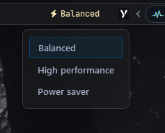
Power Plan Widget
Displays the name of the current Windows power plan and lets you switch between plans via a popup menu.
Options
| Option | Type | Default | Description |
|---|---|---|---|
label |
string | "\uf0e7 {active_plan}" |
Main label template. Use {active_plan} to insert the active plan name. |
label_alt |
string | "\uf0e7 Power plan" |
Alternate label (e.g. an icon) shown when toggled via toggle_label. |
class_name |
string | "" |
Additional CSS class name for the widget. |
update_interval |
int | 5000 |
Refresh interval in milliseconds. Set to 0 to disable periodic updates. |
menu |
dict | {} |
Popup menu options (see Menu Options below). |
callbacks |
dict | {'on_left': 'toggle_menu', 'on_middle': 'do_nothing', 'on_right': 'toggle_label'} |
Click handlers: on_left, on_middle, on_right. |
Menu Options
| Option | Type | Default | Description |
|---|---|---|---|
blur |
bool | false |
Blur background behind the popup. |
round_corners |
bool | true |
Enable rounded corners on the popup. |
round_corners_type |
string | "normal" |
Rounding style: "small", "normal". |
border_color |
string | "system" |
Border color can be None, system or Hex Color "#ff0000" |
alignment |
string | "left" |
Horizontal alignment of the menu relative to the widget (e.g., left, right, center) |
direction |
string | "down" |
Vertical opening direction: "up" or "down". |
offset_top |
int | 6 |
Vertical offset in pixels. |
offset_left |
int | 0 |
Horizontal offset in pixels. |
Example Configuration
power_plan:
  type: "yasb.power_plan.PowerPlanWidget"
  options:
    label: "<span>\uf0e7</span> {active_plan}"
    label_alt: "<span>\uf0e7</span> Power Plan {active_plan}"
    update_interval: 5000
    menu:
      blur: true
      round_corners: true
      round_corners_type: "normal"
      border_color: "system"
      alignment: "center"
      direction: "down"
      offset_top: 6
      offset_left: 0
    callbacks:
      on_left: "toggle_menu"
      on_middle: "do_nothing"
      on_right: "toggle_label"
Description of Options
- label: Main label template. Use
{active_plan}to insert the active plan name. - label_alt: Alternate label (e.g. an icon) shown when toggled via
toggle_label. - class_name: Additional CSS class name for the widget. This allows for custom styling.
- update_interval: Refresh interval in milliseconds. Set to
0to disable periodic updates. - menu: Popup menu options.
- callbacks: Click handlers for left, middle, and right mouse buttons.
Available Callbacks
toggle_label: Toggles the visibility of the label.toggle_menu: Toggles the visibility of the power plan menu popup.
Available Styles
.power-plan-widget {}
.power-plan-widget.your_class {} /* If you are using class_name option */
.power-plan-widget .widget-container {}
.power-plan-widget .label {}
.power-plan-widget .icon {}
.power-plan-menu {}
.power-plan-menu .menu-content {}
.power-plan-menu .menu-content .button {}
Note
To style label and icon with different colors for each power plan, you can follow the plan name convention:
- .balanced for Balanced plan
- .high-performance for High Performance plan
- .power-saver for Power Saver plan
- .my-custom-plan for My Custom plan
Example Style
.power-plan-widget {
    padding: 0 6px 0 6px;
}
.power-plan-widget .label {
    font-size: 12px;
}
.power-plan-widget .icon {
    font-size: 12px;
}

.power-plan-menu {
    background-color: rgba(24, 25, 27, 0.6);
}
.power-plan-widget .icon {
    padding-right: 4px;
}
.power-plan-widget .icon.balanced,
.power-plan-widget .label.balanced {
    color: #f9e2af;
}
.power-plan-widget .icon.high-performance,
.power-plan-widget .label.high-performance {
    color: #f38ba8;
}
.power-plan-widget .icon.power-saver,
.power-plan-widget .label.power-saver {
    color: #89b4fa;
}

/* Menu Style */
.power-plan-menu .menu-content {
    margin: 10px;
}
.power-plan-menu .menu-content .button {
    background-color: transparent;
    font-weight: 600;
    font-size: 13px;
    font-family: 'Segoe UI';
    padding: 6px 12px;
    margin: 1px 0;
    border: none;
    border-radius: 4px;
    text-align: left;
}
.power-plan-menu .menu-content  .button:hover {
    background-color: rgba(255, 255, 255, 0.05);
}
.power-plan-menu .menu-content .button.active {
    background-color: rgba(0, 120, 212, 0.1);
    border: 1px solid rgba(0, 120, 212, 0.4);
}
Preview of the Widget