Open-Meteo Weather Widget Options
Displays your local weather, temperature, and wind speed. It features a built-in search to easily find your location and opens an interactive weather card popup showing a 7-day forecast, UV index, rain probability, and humidity.
| Option | Type | Default | Description |
|---|---|---|---|
label |
string | '{icon}' |
The format string for the weather label. You can use placeholders like {temp}, {icon}, etc. |
label_alt |
string | '{temp}' |
The alternative format string for the weather label. |
class_name |
string | "" |
Additional CSS class name for the widget. |
tooltip |
boolean | true |
Whether to show a tooltip with the min and max temperatures. |
update_interval |
integer | 3600 |
The interval in seconds to update the weather data. Must be between 60 and 36000000. |
hide_decimal |
boolean | false |
Whether to hide the decimal part of the temperature. |
units |
string | 'metric' |
The units for the weather data. Can be 'metric' or 'imperial'. |
forecast_days |
integer | 7 |
Number of days to fetch and display in the forecast popup. Must be between 1 and 14. |
icons |
dict | See icons section | A dictionary of icons for different weather conditions. |
callbacks |
dict | { 'on_left': 'do_nothing', 'on_middle': 'do_nothing', 'on_right': 'do_nothing' } |
Callbacks for mouse events on the weather widget. |
weather_card |
dict | See below | Configuration for the weather card popup display. |
Note
: This widget uses the free Open-Meteo API - no API key required. Location is set through the built-in geocoding search when you first open the weather card.
Label Placeholders
| Placeholder | Description |
|---|---|
{temp} |
Current temperature |
{feelslike} |
Feels like temperature |
{min_temp} |
Today's minimum temperature |
{max_temp} |
Today's maximum temperature |
{humidity} |
Current relative humidity |
{pressure} |
Current pressure in hPa |
{precipitation} |
Current precipitation in mm |
{precipitation_probability} |
Today's max precipitation probability |
{wind} |
Current wind speed |
{wind_dir} |
Current wind direction in degrees |
{cloud} |
Current cloud cover percentage |
{uv} |
Today's max UV index |
{location} |
Selected location name |
{condition_text} |
Weather condition description (e.g. "Clear sky", "Moderate rain") |
{icon} |
Weather condition icon (maps to icon config) |
{is_day} |
"Day" or "Night" |
Icons
Default icon mapping (using Nerd Font glyphs):
| Icon Key | Default | Weather Conditions |
|---|---|---|
sunnyDay |
\ue30d |
Clear sky (day) |
clearNight |
\ue32b |
Clear sky (night) |
cloudyDay |
\ue312 |
Mainly clear, Partly cloudy, Overcast (day) |
cloudyNight |
\ue311 |
Mainly clear, Partly cloudy, Overcast (night) |
drizzleDay |
\udb81\ude7e |
Light/Moderate/Dense drizzle (day) |
drizzleNight |
\udb81\ude7e |
Light/Moderate/Dense drizzle (night) |
rainyDay |
\udb81\ude7e |
Rain, Rain showers (day) |
rainyNight |
\udb81\ude7e |
Rain, Rain showers (night) |
snowyDay |
\udb81\udd98 |
Snow, Snow showers (day) |
snowyNight |
\udb81\udd98 |
Snow, Snow showers (night) |
foggyDay |
\ue303 |
Fog, Rime fog (day) |
foggyNight |
\ue346 |
Fog, Rime fog (night) |
thunderstormDay |
\ue30f |
Thunderstorm (day) |
thunderstormNight |
\ue338 |
Thunderstorm (night) |
default |
\uebaa |
Unknown/fallback |
Custom Icons for Popup Menu
You can use custom PNG or SVG icons for the weather card popup and hourly forecast. The widget checks for custom icons in your configuration directory before falling back to the default SVGs.
To use custom icons, place your files in:
C:/Users/{username}/.config/yasb/icons/openmeteo/
The file names must match the following icon keys (with .png or .svg extension):
sunnyDay,clearNightcloudyDay,cloudyNightfoggyDay,foggyNightdrizzleDay,drizzleNightrainyDay,rainyNightsnowyDay,snowyNightthunderstormDay,thunderstormNightdefault
For example, sunnyDay.png or sunnyDay.svg in that folder will override the default icon for clear skies.
Note
: Custom icons are cached in memory. If you add or change your custom icon files, you will need to restart YASB for the changes to take effect.
Minimal Configuration
open_meteo:
  type: "yasb.open_meteo.OpenMeteoWidget"
  options:
    label: "<span>{icon}</span> {temp}"
    label_alt: "{location}: Min {min_temp}, Max {max_temp}, Humidity {humidity}"
    tooltip: true
    update_interval: 600
    hide_decimal: true
    units: "metric"
    forecast_days: 7
    callbacks:
      on_left: "toggle_card"
      on_middle: "do_nothing"
      on_right: "toggle_label"
Advanced Configuration
open_meteo:
  type: "yasb.open_meteo.OpenMeteoWidget"
  options:
    label: "<span>{icon}</span> {temp}"
    label_alt: "{location}: Min {min_temp}, Max {max_temp}, Humidity {humidity}"
    tooltip: true
    update_interval: 600
    hide_decimal: true
    units: "metric"
    forecast_days: 7
    callbacks:
      on_left: "toggle_card"
      on_middle: "do_nothing"
      on_right: "toggle_label"
    icons:
      sunnyDay: "\ue30d"
      clearNight: "\ue32b"
      cloudyDay: "\ue312"
      cloudyNight: "\ue311"
      drizzleDay: "\udb81\ude7e"
      drizzleNight: "\udb81\ude7e"
      rainyDay: "\ue308"
      rainyNight: "\ue333"
      snowyDay: "\ue30a"
      snowyNight: "\ue335"
      foggyDay: "\ue303"
      foggyNight: "\ue346"
      thunderstormDay: "\ue30f"
      thunderstormNight: "\ue338"
      default: "\uebaa"
    weather_card:
      blur: true
      round_corners: true
      round_corners_type: "normal"
      border_color: "system"
      alignment: "right"
      direction: "down"
      icon_size: 48
      show_hourly_forecast: true
      time_format: "24h"
      hourly_point_spacing: 76
      hourly_icon_size: 24
      icon_smoothing: true
      temp_line_width: 2
      current_line_color: "#8EAEE8"
      current_line_width: 1
      current_line_style: "dot"
      hourly_gradient:
        enabled: false
        top_color: "#8EAEE8"
        bottom_color: "#2A3E68"
      hourly_forecast_buttons:
        enabled: true
        default_view: "temperature"
        temperature_icon: "\udb81\udd99"
        rain_icon: "\udb81\udd96"
        snow_icon: "\udb81\udd98"
      weather_animation:
        enabled: false
        snow_overrides_rain: true
        temp_line_animation_style: both
        rain_effect_intensity: 1.0
        snow_effect_intensity: 1.0
        scale_with_chance: true
Description of Options
- label: The format string for the weather label. See Label Placeholders for available placeholders.
- label_alt: The alternative format string for the weather label. Toggled via
toggle_labelcallback. - class_name: Additional CSS class name for the widget. This allows for custom styling.
- update_interval: The interval in seconds to update the weather data. Must be between 60 and 36000000.
- hide_decimal: Whether to hide the decimal part of the temperature.
- tooltip: Whether to show a tooltip with the min/max temperatures and precipitation info.
- units: The units for the weather data. Can be
'metric'(°C, km/h) or'imperial'(°F, mph). - forecast_days: Number of days to fetch from the Open-Meteo API and show in the forecast popup. Must be between
1and14. Defaults to7. - icons: A dictionary of icons for different weather conditions. The icon keys are mapped from WMO weather codes. See Icons for the full list.
- weather_card: Configuration for the weather card popup display.
- blur: Enable blur effect for the weather card.
- round_corners: Enable round corners for weather card.
- round_corners_type: Border type for weather card can be
normalandsmall. Default isnormal. - border_color: Border color for weather card can be
None,SystemorHex Color"#ff0000". - alignment: Alignment of the weather card. Possible values are
left,center, andright. - direction: Direction of the weather card. Possible values are
upanddown. - offset_top: Offset from the top of the widget in pixels.
- offset_left: Offset from the left of the widget in pixels.
- icon_size: Size of the weather icon in pixels.
- show_hourly_forecast: Whether to show the hourly forecast in the weather card. Set to
falseto disable. - time_format: Time format for the weather card. Possible values are
12hand24h. - hourly_point_spacing: Spacing between hourly points on the curve.
- hourly_icon_size: Size of the hourly icon.Better to set 16, 32 or 64 for better quality.
- icon_smoothing: Whether to smooth the icon on hourly view.
- temp_line_width: Width of the temperature line. Setting this to
0will hide the temperature line. - current_line_color: Color of the current hour line.
- current_line_width: Width of the current hour line. Setting this to
0will hide it. - current_line_style: Style of the current hour line. Possible values are
solid,dash,dot,dashDot,dashDotDot. - hourly_gradient: Configuration for the gradient effect under the hourly line.
- enabled: Whether to enable the gradient effect under the hourly line.
- top_color: Top color of the gradient.
- bottom_color: Bottom color of the gradient.
- hourly_forecast_buttons: Configuration for the data type toggle buttons in the hourly forecast view.
- enabled: Whether to show the toggle buttons.
- default_view: Which data type to show by default. Options:
"temperature"(default),"rain", or"snow". - temperature_icon: Icon for the temperature button.
- rain_icon: Icon for the rain chance button.
- snow_icon: Icon for the snow chance button.
- weather_animation: Configuration for the weather animation effects.
- enabled: Whether to enable rain/snow animation effects.
- snow_overrides_rain: Whether to override the rain animation with the snow animation (if overlapping).
- temp_line_animation_style: Which animation style to use for the temperature line. Options:
rain,snow,both, ornone. - rain_effect_intensity: Intensity of the rain animation. (0.01 - 10.0, Default: 1.0)
- snow_effect_intensity: Intensity of the snow animation. (0.01 - 10.0, Default: 1.0)
- scale_with_chance: Whether to scale the animation intensity with the chance of rain/snow.
- callbacks: A dictionary specifying the callbacks for mouse events. Available callback functions are
toggle_card,toggle_label,do_nothing.
Location Setup
When you first open the weather card (click on the widget), a location search dialog appears:
- Type a city name (minimum 2 characters)
- A dropdown list of matching locations appears
- Click on a location to select it
- The widget saves the location and starts fetching weather data
The location is stored in %LOCALAPPDATA%/YASB/weather.json. Each widget instance on different screens gets its own entry, so you can have different locations for different monitors.
To change the location, click on the location name / current temperature displayed at the very top of the weather card. This will reset the widget and show the location search dialog again.
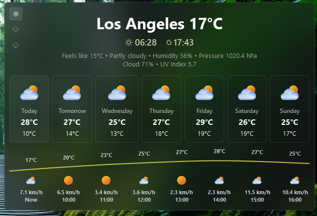
Forecast Card
The weather card shows:
- Current conditions: Location, temperature, feels-like, humidity, pressure, cloud cover, wind, precipitation, UV index
- Forecast row: Day name, weather icon, min/max temperature for each day (1-14 days, controlled by
forecast_days) - Hourly chart (if
show_hourly_forecastis enabled): Temperature curve, rain/snow toggle, weather icons, wind speed - Clicking a day in the forecast row switches the hourly chart to that day's data
Example Style
.open-meteo-widget {}
.open-meteo-widget .widget-container {}
.open-meteo-widget .label {}
.open-meteo-widget .label.alt {}
.open-meteo-widget .icon {}

/* Individual weather icons */
.open-meteo-widget .icon.sunnyDay {}
.open-meteo-widget .icon.clearNight {}
.open-meteo-widget .icon.cloudyDay {}
.open-meteo-widget .icon.cloudyNight {}
.open-meteo-widget .icon.drizzleDay {}
.open-meteo-widget .icon.drizzleNight {}
.open-meteo-widget .icon.rainyDay {}
.open-meteo-widget .icon.rainyNight {}
.open-meteo-widget .icon.snowyDay {}
.open-meteo-widget .icon.snowyNight {}
.open-meteo-widget .icon.foggyDay {}
.open-meteo-widget .icon.foggyNight {}
.open-meteo-widget .icon.thunderstormDay {}
.open-meteo-widget .icon.thunderstormNight {}
.open-meteo-widget .icon.default {}

/* Weather card style */
.open-meteo-widget {
    padding: 0 6px;
}
.open-meteo-widget .icon {
    font-size: 18px;
    color: rgba(255, 255, 255, 0.8);
}
.open-meteo-widget .label {
    font-size: 13px;
    font-family: "Segoe UI";
    font-weight: 400;
    color: rgba(255, 255, 255, 0.8);
    padding-left: 4px;
}
.open-meteo-card {
    background-color: rgba(27, 26, 26, 0.5);
    min-width: 500px;
}
.open-meteo-card-today .label {
    font-size: 13px;
    font-family: "Segoe UI";
    font-weight: 400;
    color: rgb(163, 163, 163);
}
.open-meteo-card-today .label.location {
    font-size: 32px;
    font-weight: 700;
    font-family: "Segoe UI";
    color: rgb(255, 255, 255);
}
.open-meteo-card-today .label.sunrisesunset {
    font-size: 18px;
    font-family: "Segoe UI";
    font-weight: 600;
    color: rgb(201, 204, 159);
}
.open-meteo-card-today .label.sunrisesunset-icon {
    font-size: 18px;
    color: rgb(201, 204, 159);
    font-family: "JetBrainsMono NFP";
}
.open-meteo-card-day {
    border: 1px solid rgba(255, 255, 255, 0.1);
    border-radius: 8px;
    background-color: rgba(0, 0, 0, 0);
    padding: 4px;
    min-width: 70px;
}
.open-meteo-card-day .day-name {
    font-family: "Segoe UI";
    color: rgba(255, 255, 255, 0.6);
    font-size: 12px;
    font-weight: 600;
}
.open-meteo-card-day .day-temp-max {
    font-family: "Segoe UI";
    font-weight: 700;
    font-size: 16px;
    color: rgb(255, 255, 255);
}
.open-meteo-card-day .day-temp-min {
    font-family: "Segoe UI";
    color: rgb(255, 255, 255);
    font-weight: 400;
    font-size: 13px;
}
.open-meteo-card-day.active {
    background-color: rgba(255, 255, 255, 0.05);
    border: 1px solid rgba(255, 255, 255, 0.08);
}
.open-meteo-card-day:hover {
    background-color: rgba(255, 255, 255, 0.04);
}
.open-meteo-card .hourly-container {
    border: none;
    background-color: transparent;
    min-height: 120px;
}
.open-meteo-card .hourly-data {
    font-size: 11px;
    font-weight: 700;
    font-family: "Segoe UI";
}
.open-meteo-card .hourly-data.temperature {
    background-color: #c9be48;
}
.open-meteo-card .hourly-data.rain {
    background-color: #4a90e2;
}
.open-meteo-card .hourly-data.snow {
    background-color: #a0c4ff;
}
.open-meteo-card .hourly-data .hourly-rain-animation {
    color: rgba(150, 200, 255, 40);
    background-color: rgba(0, 0, 0, 0);
}
.open-meteo-card .hourly-data .hourly-snow-animation {
    color: rgba(255, 255, 255, 150);
    background-color: rgba(0, 0, 0, 0);
}
.open-meteo-card .hourly-data-buttons {
    margin-top: 11px;
    margin-left: 11px;
}
.open-meteo-card .hourly-data-button {
    border-radius: 4px;
    min-height: 24px;
    min-width: 24px;
    max-width: 24px;
    max-height: 24px;
    font-size: 14px;
    color: rgba(255, 255, 255, 0.3);
    border: 1px solid transparent;
}
.open-meteo-card .hourly-data-button.active {
    color: #fff;
    background-color: rgba(255, 255, 255, 0.1);
    border: 1px solid rgba(255, 255, 255, 0.1);
}
.open-meteo-card .search-head {
    font-size: 18px;
    font-family: "Segoe UI";
    font-weight: 600;
    color: rgba(255, 255, 255, 0.9);
}
.open-meteo-card .search-description {
    font-size: 14px;
    font-family: "Segoe UI";
    font-weight: 400;
    color: rgba(255, 255, 255, 0.7);
    padding-bottom: 8px;
}
.open-meteo-card .no-data-icon {
    font-size: 88px;
}
.open-meteo-card .no-data-text {
    font-size: 16px;
    font-family: "Segoe UI";
    font-weight: 400;
}
/* search dialog */
.open-meteo-card .search-input {
    padding: 8px 12px;
    border: 1px solid #5e6070;
    border-radius: 6px;
    background-color: rgba(17, 17, 27, 0.1);
    color: #cdd6f4;
    font-family: "Segoe UI";
    font-size: 14px;
}
.open-meteo-card .search-input:focus {
    border: 1px solid #89b4fa;
    background-color: rgba(17, 17, 27, 0.2);
}
.open-meteo-card .search-results {
    border: 1px solid #45475a00;
    border-radius: 6px;
    background-color: rgba(0, 0, 0, 0);
    color: #cbced8;
    font-size: 13px;
    font-family: "Segoe UI";
}
.open-meteo-card .search-results::item {
    padding: 6px;
}
.open-meteo-card .search-results::item:hover {
    background-color: rgba(255, 255, 255, 0.05);
}
Preview of the Weather Card