Styling#
Style file#
Styling is done using the CSS file format and with a file named styles.css.
Default directories for this file are C:/Users/{username}/.config/yasb/ or the ENV variable YASB_CONFIG_HOME if set.
Themes & Community Styles#
If you don't want to design your own status bar layout or write CSS styling rules from scratch, you can use the built-in Themes Manager (yasb_themes.exe) to browse, preview, and install custom styles created by the community.
Using the Themes Manager#
You can launch the Themes Manager in a few ways:
- System Tray Context Menu: Right-click the YASB icon in your system tray and select Get Themes.
- Direct Execution: Double-click
yasb_themes.exeinside your YASB installation folder.
Within the visual Themes Manager interface, you can:
- Search and Filter: Quickly filter themes by name.
- Preview Readmes: Click on any theme to read its custom features, keybindings, and optional widget setups.
- Inspect Screenshots: Hover your cursor over any theme preview image to zoom in with a magnifier.
- One-Click Installation: Click the install button to automatically download and activate the theme, backing up your existing config files.
One-Click Theme Installation Protocol (yasb-themes://)#
YASB registers a custom URL protocol (yasb-themes://) with Windows. When you browse the community themes on the official yasb.dev website and click a theme's install button, it will automatically open the Themes Manager on your computer and download the selected theme directly.
Bar styling#
The main YASB window can be styled with the following:
.yasb-bar
Widget Group Styling#
Each widget group can be styled individually with the following:
.container-left.container-center.container-right
Adaptive bar style#
A bar with style: "adaptive" gets an extra .adaptive class and paints its own shape instead of
a plain rectangle. By default a thin rail runs along the outer edge of the bar, and each widget
group hangs below it as its own island, with transparent gaps between them. Islands are optional
though, turn them off and it's a plain full-width bar that can still curve its outer corners.
The background-color of .yasb-bar fills that shape, so your existing colors keep working.
The shape itself comes from the stylesheet and reloads with the rest of your theme.
.yasb-bar.adaptive {
    background-color: rgba(20, 20, 22, 0.94);
    -qproperty-railheight: 4;
    -qproperty-islandradius: 16;
    -qproperty-grouppadding: 8;
}
| Property | Default | Description |
|---|---|---|
-qproperty-railheight |
4 |
Height of the rail along the outer edge of the bar. |
-qproperty-islandradius |
16 |
Radius of the curve between the rail and an island. Capped at (height - railheight) / 2, so on a 40px bar with a 4px rail you cannot go above 18. |
-qproperty-grouppadding |
8 |
Space around each group's content. This grows the island, it does not move the widgets. Use padding on .container-left and friends to move the widgets themselves. |
-qproperty-islands |
true |
Set to false for a solid, full-width bar instead of separate islands. railheight, islandradius, grouppadding and style_adaptive_exclude have nothing left to do in this mode, there are no islands left to split. edgeradius still works, so you can have a plain bar with just the two outer corners curved. |
-qproperty-edgeradius |
0 |
Curves the outer islands down into the screen edges. 0 is off, see below. |
-qproperty-borderwidth |
0 |
Width of a border drawn inside the shape, the one a CSS border cannot follow. 0 is off, see below. |
-qproperty-bordercolor |
transparent | Colour of that border. Any CSS colour, including rgba(). |
Note
These use a -qproperty- prefix, not Qt's own qproperty-. The leading dash is there so
editors and linters read it as a vendor-prefixed property and stay quiet instead of flagging
it as unknown. YASB strips the dash before the stylesheet reaches Qt, so the effect is
identical either way. Write -qproperty-, not qproperty-.
Note
The property names are lowercase and only do something on style: "adaptive". Scope them to
.yasb-bar.adaptive so your other bars ignore them.
Note
Qt reads a qproperty once, when the widget is polished, and never clears one you delete
(Qt docs). Changing
a value works on save, but deleting a line keeps the old value until YASB restarts. Set it back
to the default instead of deleting it.
A CSS border will not follow the shape. Qt draws it on the bar's rectangle before the shape is
cut out of it, so a border-bottom survives only where an island happens to reach the bottom of
that rectangle, and disappears altogether once edgeradius moves it below the bar. Turn it off,
and make the widget backgrounds transparent so the islands read as one surface.
.yasb-bar.adaptive {
    border: none;
}
.yasb-bar.adaptive .widget {
    background-color: transparent;
}
Bordering the shape#
-qproperty-borderwidth and -qproperty-bordercolor draw the border a CSS border cannot, along
the island corners, the fillets either side of a gap and the edge curves. It is drawn inside the
shape, so it does not change the bar's silhouette.
.yasb-bar.adaptive {
    border: none;
    -qproperty-borderwidth: 1;
    -qproperty-bordercolor: #ffffff;
}
It follows the side of the bar the gaps are on and stops there, so it does not draw along the screen edges. Both properties are needed, either one alone leaves it off.
Curving into the screen edges#
-qproperty-edgeradius rounds the two corners where the bar meets the edges of the screen, so the
desktop below looks like it has rounded top corners.
.yasb-bar.adaptive {
    -qproperty-edgeradius: 14;
}
The bar window grows by that many pixels to have room for the curve. Your widgets do not move,
and the space Windows reserves for the bar does not change, it is still dimensions.height plus
padding.
Note
This needs a bar that actually reaches the screen edges, so it is ignored unless
dimensions.width spans the screen. It also paints outside the bar, which means the small
corner areas will swallow clicks meant for the desktop.
Generic Widget Style#
A style with the .widget selector would affect all the widgets. In practice, you may prefer to use more specific .*-widget selectors.
Example: how to target the clock widget
.clock-widget {
    border-top-left-radius: 18px;
    border-bottom-left-radius: 18px;
}
Default style for all elements#
* { font-size: 13px;color: #cdd6f4; }
Example above will set the default font size and color of all elements unless overridden later on.
Style Icons#
Icons can be styled with the following:
.icon
.icon class above will affect all icons inside the span tag in configuration file.
label: "<span>\uf4bc</span> {virtual_mem_free}"
You can specify different icon class in the configuration file as shown below.
label: "<span class=\"icon-1\">\uf4bc</span> {virtual_mem_free}"
Note
:
To avoid some icons being cut off on the sides, it's recommended to use the proportional version of your Nerd Font (e.g. JetBrainsMono Nerd Font Propo),
Style Text#
Text can be styled with the following:
.label
Widget Container Styling#
Each icon and text is wrapped in a container. This container can be styled with the following:
.widget-container
Example how to target widget container
.clock-widget .widget-container {
    background-color: #1e1e1e;
    border-radius: 10px;
}
.media-widget .widget-container {
    background-color: #1e1e1e;
    border-radius: 10px;
}
Note
Keep in mind that YASB is written in Python using Qt framework and utilizes a custom CSS engine, so styling might be different from regular CSS3.
Animations#
Animations can be added to widgets using transition property. It follows the same syntax as CSS transitions, but uses custom animation engine for PyQt6/PySide6.
Example of simple color transition on hover:
.glazewm-workspaces .ws-btn {
    /* other properties... */
    background: transparent;
    transition: background 200ms ease-in-out;
}

.glazewm-workspaces .ws-btn:hover {
    /* This will be animated on mouse hover */
    background: gray;
}
Example of widget size and background transition on class change using all keyword and padding:
.glazewm-workspaces .ws-btn {
    /* other properties... */
    padding: 1px 4px;
    transition: all 200ms ease-out;
}

.glazewm-workspaces .ws-btn.focused_populated,
.glazewm-workspaces .ws-btn.focused_empty {
     /* These two properties be animated on workspace change */
    padding: 1px 50px;
    background: gray;
}
Same can be done with width and height properties, or min/max-width and min/max-height if widget requires that (usually when nested widgets are involved, like GlazeWM with icons):
.glazewm-workspaces .ws-btn {
    /* other properties */
    transition: all 200ms ease-out;
}

.glazewm-workspaces .ws-btn.focused_populated,
.glazewm-workspaces .ws-btn.focused_empty {
    /* Size will be animated from the default to the min/max values*/
    min-width: 50px;
    max-width: 50px;
}
Global opacity transition for all widget containers to add subtle fade effect on click:
.widget-container {
    opacity: 1.0;
    transition: opacity 80ms;
}

.widget-container:clicked,
.widget-container:pressed {
    opacity: 0.5;
}
A delay can also be added to the transition as second time variable transition: all 200ms 50ms ease-out. Negative delay will result in animation starting instantly, but as if it was playing for the time of the delay.
Easing functions can be used as well, for example ease-in-out or cubic-bezier(0.5, 0.2, 0.3, 0.9). Check this tool for cubic-bezier visualization.
Steps function is also supported.
Animation-supported pseudo-classes#
:hover:focus:active(Window focus pseudo. Not the same as:activein regular CSS):pressed(Equivalent to:activein regular CSS):checked:clicked(Special case. Will play the full animation on click)
Additional supported CSS properties#
opacitybox-shadowtext-shadowcursor(not animatable)
Animation limitations#
Animations can't be added to sub-controls, for example ::item or ::chunk or others. Only regular QtCSS styling is available for those.
Supported color functions (not animatable)#
linear-gradient()radial-gradient()conic-gradient()
Follow OS Theme#
YASB can follow the OS theme, if you have OS dark style YASB will add class .dark on the root element, if you want to have different light and dark themes you can use the following CSS to achieve this.
.yasb-bar {
    /* background color for light style */
    background-color: #f3f3f3;
}
.dark.yasb-bar {
    /* background color for dark style */
    background-color: #1e1e1e;
}
.yasb-bar .label {
    /* text color for light style */
    color: #000000;
}
.dark.yasb-bar .label {
    /* text color for dark style */
    color: #ffffff;
}
.icon {
    color: #cdd6f4;
}
Context Menu Styling#
Context menus can be styled using the .context-menu class. This allows you to customize the appearance of menus within YASB.
Note
: If you want to have different menu styles for each widget please refer to the Widget documentation for more information on how to achieve this. You can add dark class to context menu if you want to have a different style for dark mode as shown in the example below.
Example of context menu styling:
/* Global context menu style */
.context-menu,
.context-menu .menu-checkbox {
    background-color: #202020;
    border: none;
    padding: 4px 0px;
    font-family: 'Segoe UI';
    font-size: 12px;
    color: #FFFFFF;
}
/* Dark style (optional) */
.dark.context-menu,
.dark.context-menu .menu-checkbox {
    background-color: #202020;
    color: #FFFFFF;
}
.context-menu::right-arrow {
    width: 8px;
    height: 8px;
    padding-right: 24px;
}
.context-menu::item,
.context-menu .menu-checkbox {
    background-color: transparent;
    padding: 6px 12px;
    margin: 2px 6px;
    border-radius: 6px;
    min-width: 100px;
}
.context-menu::item:selected,
.context-menu .menu-checkbox:hover {
    background-color: #3a3a3a;
    color: #FFFFFF;
}
.context-menu::separator {
    height: 1px;
    background-color: #404040;
    margin: 4px 8px;
}
.context-menu::item:disabled {
    color: #666666;
    background-color: transparent;
}
.context-menu .menu-checkbox .checkbox {
    border: none;
    padding: 8px 16px;
    font-size: 12px;
    margin: 0;
    color: #FFFFFF;
    font-family: 'Segoe UI'
}
.context-menu .submenu::item:disabled {
    margin: 0;
    padding-left: 16px;
}
.context-menu .menu-checkbox .checkbox:unchecked {
    color: #999
}
.context-menu .menu-checkbox .checkbox::indicator {
    width: 12px;
    height: 12px;
    margin-left: 0px;
    margin-right: 8px;
}
.context-menu .menu-checkbox .checkbox::indicator:unchecked {
    background: #444444;
    border-radius: 2px;
}
.context-menu .menu-checkbox .checkbox::indicator:checked {
    background: #007acc;
    border-radius: 2px;
}
.context-menu .menu-checkbox .checkbox:focus {
    outline: none;
}
.context-menu::item:checked {
    background-color: #0078d7;
    color: white;
}
Note
: More information about context menu styling can be found in the Qt documentation.
Tooltip Styling#
Tooltips can be styled using the .tooltip class. This allows you to customize the appearance of tooltips within YASB.
Example of tooltip styling:
.tooltip {
    background-color: #18191a;
    border: 1px solid #36383a;
    border-radius: 4px;
    color: #a6adc8;
    padding: 6px 12px;
    font-size: 13px;
    font-family: 'Segoe UI';
    font-weight: 600;
    margin-top: 4px;
}
/* Dark style (optional) */
.dark.tooltip {
    background-color: #18191a;
    border: 1px solid #36383a;
    color: #a6adc8;
}
System Colors#
YASB can automatically fetch your Windows accent colors and provide them as CSS variables. To use this, you must first enable system_colors: true in your config.yaml.
Once enabled, YASB will generate a yasb_colors.css file in your configuration directory. You can import this file at the top of your styles.css to use the dynamic variables:
@import "yasb_colors.css";

.yasb-bar {
    /* Solid color */
    background-color: var(--yasb-background);
}

.clock-widget {
    /* Mix color with 50% opacity using the -rgb variable variant */
    border-color: rgba(var(--yasb-accent-rgb), 0.5);
    color: var(--yasb-accent-light2);
}
Available color variables (each provides both a var(--name) and a var(--name-rgb) variant):
--yasb-accent--yasb-accent-dark1--yasb-accent-dark2--yasb-accent-dark3--yasb-accent-light1--yasb-accent-light2--yasb-accent-light3--yasb-background--yasb-foreground
Icons#
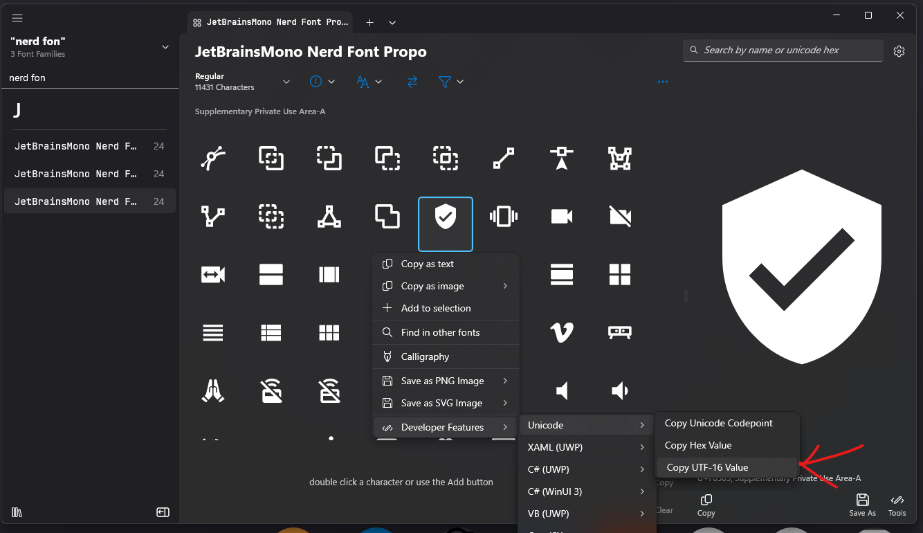
There is a nice app at Character Map UWP where you can select a font, click on icons, and copy the UTF-16 value. Alternatively, you can visit the Nerd Fonts site and do the same under the icons section.