Notes Widget Configuration#
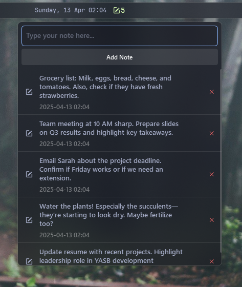
A quick note-taking utility that opens a scratchpad popup directly from your status bar. It lets you write, save, copy, and delete quick notes on the fly, showing how many notes you have, and can be configured to float anywhere on the screen.
| Option | Type | Default Value | Description |
|---|---|---|---|
label |
String | <span>\udb82\udd0c</span> {count} |
Primary label template, supports the {count} placeholder which is replaced with the number of notes. |
label_alt |
String | {count} notes |
Alternative label format used when switching widget modes. |
class_name |
String | "" |
Additional CSS class name for the widget. |
data_path |
String | "" |
Custom path to JSON file for storing notes. Leave empty to use default location (~/.config/yasb/notes.json). Supports ~ for home directory. |
start_floating |
Boolean | false |
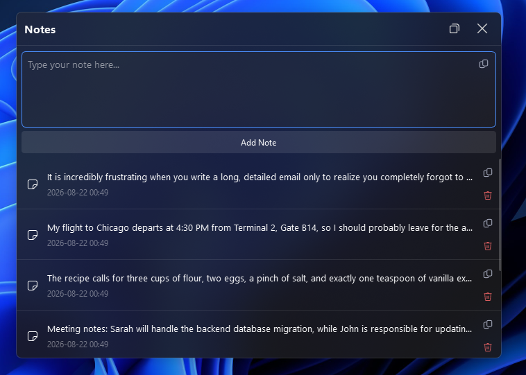
Whether the menu should start in floating mode. |
paste_plain_text |
Boolean | false |
If true, the widget will paste plain text from the clipboard by default, while Shift+Ctrl+V will paste rich text. |
enter_to_add_note |
Boolean | true |
If true, pressing Enter in the input field will add a new note and Shift+Enter will add a new line. |
menu |
Dict | See below | Popup menu settings. See details below. |
icons |
Dict | See below | Icons used within the widget. See details below. |
keybindings |
List | [] |
Optional hotkeys. See Keybindings. |
callbacks |
Dict | See below | Maps mouse actions to widget functions (e.g., toggling the menu or label). |
Callbacks#
The callbacks option maps mouse buttons (on_left, on_middle, on_right) to actions. All keys are optional, the values shown are the defaults.
callbacks:
  on_left: "toggle_menu"
  on_middle: "do_nothing"
  on_right: "toggle_label"
Available actions:
toggle_label- Switch betweenlabelandlabel_alt.toggle_menu- Open or close the popup menu.update_label- Refresh the label now.do_nothing- Do nothing.exec <command>- Run a command, for exampleexec cmd.exe /c start ms-settings:network.
Menu Options#
| Option | Type | Default Value | Description |
|---|---|---|---|
blur |
Boolean | true |
Enables a blur effect in the menu popup. |
round_corners |
Boolean | true |
If true, the menu has rounded corners. |
round_corners_type |
String | "normal" |
Determines the corner style; allowed values are normal and small. |
border_color |
String | "System" |
Sets the border color for the menu. |
alignment |
String | "right" |
Horizontal alignment of the menu relative to the widget (e.g., left, right, center). |
direction |
String | "down" |
Direction in which the menu opens. |
offset_top |
Integer | 6 |
Vertical offset for fine positioning of the menu. |
offset_left |
Integer | 0 |
Horizontal offset for fine positioning. |
show_date_time |
Boolean | true |
Indicates whether to display the note’s timestamp. |
Icons Options#
| Option | Type | Default Value | Description |
|---|---|---|---|
note |
String | "\ue70b" |
Icon representing a note. |
delete |
String | "\ue74d" |
Icon used for the delete action. |
copy |
String | "\ue8c8" |
Icon for copying text. |
float_on |
String | "\ue922" |
Icon shown when floating can be enabled. |
float_off |
String | "\ue923" |
Icon shown when floating can be disabled. |
close |
String | "\ue8bb" |
Icon for the close button in the header. |
Important
This widget will save notes in JSON format in .config/yasb/notes.json. You can just backup this file to save your notes and restore them later.
Example Configuration#
notes:
  type: "yasb.notes.NotesWidget"
  options:
    label: "<span>\ue70b</span> {count}"
    label_alt: "{count} notes"
    # data_path: "~/Documents/my-notes.json"  # Optional: custom JSON file path
    menu:
      blur: true
      round_corners: true
      round_corners_type: "normal"
      border_color: "System"
      alignment: "right"
      direction: "down"
      offset_top: 6
      offset_left: 0
      show_date_time: true
    icons:
      note: "\ue70b"
      delete: "\ue74d"
      copy: "\ue8c8"
      float_on: "\ue922"
      float_off: "\ue923"
      close: "\ue8bb"
    callbacks:
      on_left: "toggle_menu"
      on_middle: "do_nothing"
      on_right: "toggle_label"
Description of Options#
- label Primary label template. It can include the
{count}placeholder, which is dynamically replaced with the number of notes. - label_alt Alternative label format used when switching modes.
- class_name Additional CSS class name for the widget. This allows for custom styling.
- data_path Optional custom path to the JSON file where notes are stored. If empty or not specified, uses the default location (
~/.config/yasb/notes.json). Supports~for home directory expansion (e.g.,~/Documents/my-notes.jsonorC:/Users/YourName/my-notes.json). - enter_to_add_note If true, pressing Enter in the input field will add a new note and Shift+Enter will add a new line. If false it's reversed.
- paste_plain_text If true, the widget will paste plain text from the clipboard by default, while Shift+Ctrl+V will paste rich text. If false it's reversed
- start_floating If true, the menu will start in floating mode.
- menu Settings for the popup menu displayed when interacting with notes:
- blur: Enables a blur effect in the menu.
- round_corners: If true, the menu is displayed with rounded corners.
- round_corners_type: Determines the corner style. Allowed values are
normalandsmall. - border_color: Color for the menu border.
- alignment: The horizontal alignment of the menu relative to the widget.
- direction: The direction in which the menu opens (typically "down").
- offset_top and offset_left: Numeric offsets for fine control of the menu’s position.
- show_date_time: Indicates whether the note’s timestamp is displayed.
- icons Defines the icons used within the widget:
- note: Icon representing a note.
- delete: Icon used for the delete action.
- copy: Icon for copying text.
- float_on: Icon shown when floating can be enabled.
- float_off: Icon shown when floating can be disabled.
- close: Icon for the close button in the header.
- keybindings A list of global hotkeys for this widget. See Keybindings.
- callbacks: Mouse event callbacks. See Callbacks.
Available Styles#
/* Main widget container */
.notes-widget {}
.notes-widget.your_class {} /* If you are using class_name option */
/* Labels and icons */
.notes-widget .label {}
.notes-widget .icon {}
/* Popup menu */
.notes-menu {}
/* Floating popup menu */
.notes-menu.floating {}
/* Popup menu header */
.notes-menu .notes-header {}
/* Header title */
.notes-menu .notes-header .header-title {}
/* Floating toggle button */
.notes-menu .notes-header .float-button {}
/* Close button */
.notes-menu .notes-header .close-button {}
/* Note items inside the menu */
.notes-menu .note-item {}
/* Title text within each note item */
.notes-menu .title {}
/* Date text shown under the title */
.notes-menu .date {}
/* Message shown when no notes exist */
.notes-menu .empty-list {}
/* Buttons in the menu for add & cancel */
.notes-menu .add-button,
.notes-menu .cancel-button {}
/* Scroll area that contains all notes */
.notes-menu .scroll-area {}
/* Text input for adding notes */
.notes-menu .note-input {}
/* Focus style for the note input */
.notes-menu .note-input:focus {}
/* Copy button inside the input field */
.notes-menu .input-copy-button {}
.notes-menu .input-copy-button:hover {}
.notes-menu .input-copy-button:pressed {}
/* Button to delete a note */
.notes-menu .delete-button {}
/* Button hover effect */
.notes-menu .delete-button:hover {}
/* Button pressed effect */
.notes-menu .delete-button:pressed {}
/* Button to copy text */
.notes-menu .copy-button {}
/* Button hover effect */
.notes-menu .copy-button:hover {}
/* Button pressed effect */
.notes-menu .copy-button:pressed {}
/* Button pressed effect */
Example Style#
.notes-widget {
    padding: 0;
}
.notes-widget .label {
    font-size: 14px;
    color: #dbfeb4;
}
.notes-widget .icon {
    font-size: 16px;
    color: #dbfeb4;
    font-family: "Segoe Fluent Icons";
}
/* Notes Widget Menu */
.notes-menu {
    min-width: 400px;
    max-width: 400px;
    min-height: 500px;
    background-color: rgba(27, 27, 27, 0.8);
}
/* Floating state - can have different size */
.notes-menu.floating {
    min-width: 700px;
    max-width: 700px;
    min-height: 500px;
    max-height: 500px;
}
/* Notes Widget Menu Header */
.notes-menu .notes-header {
    background-color: rgba(0, 0, 0, 0);
    padding: 4px;
    border-bottom: 1px solid rgba(255, 255, 255, 0.1);
}
.notes-menu .notes-header .header-title {
    font-size: 16px;
    font-weight: 800;
    color: white;
}
.notes-menu .notes-header .float-button,
.notes-menu .notes-header .close-button {
    background-color: transparent;
    border: none;
    color: #cfcfcf;
    font-size: 14px;
    min-height: 32px;
    max-height: 32px;
    min-width: 32px;
    max-width: 32px;
    font-family: "Segoe Fluent Icons";
}
.notes-menu .notes-header .float-button:hover,
.notes-menu .notes-header .close-button:hover {
    background-color: rgba(255, 255, 255, 0.1);
    border-radius: 4px;
}
.notes-menu .notes-header .close-button {
    margin-left: 8px;
}
.notes-menu .note-item {
    background-color: transparent;
    border-bottom: 1px solid rgba(255, 255, 255, 0.1);
}
.notes-menu .note-item:hover {
    background-color: rgba(255, 255, 255, 0.1);
}
.notes-menu .note-item .icon {
    font-size: 16px;
    padding: 0 4px;
    font-family: "Segoe Fluent Icons";
}
.notes-menu .delete-button {
    color: #ff6b6b;
    background: transparent;
    border: none;
    font-size: 12px;
    min-height: 24px;
    max-height: 24px;
    min-width: 24px;
    max-width: 24px;
    border-radius: 4px;
    font-family: "Segoe Fluent Icons";
}
.notes-menu .delete-button:hover {
    background-color: rgba(128, 128, 128, 0.5);
}
.notes-menu .copy-button {
    color: #babfd3;
    background: transparent;
    border: none;
    font-size: 14px;
    min-height: 24px;
    max-height: 24px;
    min-width: 24px;
    max-width: 24px;
    border-radius: 4px;
    margin-bottom: 4px;
    font-family: "Segoe Fluent Icons";
}
.notes-menu .copy-button:hover {
    background-color: rgba(128, 128, 128, 0.5);
}
.notes-menu .copy-button:pressed {
    color: #ffffff;
}
.notes-menu .note-item .title {
    font-size: 13px;
    font-family: 'Segoe UI'
}
.notes-menu .note-item .date {
    font-size: 12px;
    font-family: 'Segoe UI';
    color: rgba(255, 255, 255, 0.4);
}
.notes-menu .empty-list {
    font-family: 'Segoe UI';
    color: rgba(255, 255, 255, 0.2);
    font-size: 24px;
    font-weight: 600;
    padding: 10px 0 20px 0;
}
.notes-menu .add-button,
.notes-menu .cancel-button {
    padding: 8px;
    background-color: rgba(255, 255, 255, 0.1);
    border: none;
    border-radius: 4px;
    color: white;
    font-family: 'Segoe UI'
}
.notes-menu .cancel-button {
    margin-left: 4px;
}
.notes-menu .add-button:hover,
.notes-menu .cancel-button:hover {
    background-color: rgba(255, 255, 255, 0.2);
}
.notes-menu .scroll-area {
    background: transparent;
    border: none;
    border-radius: 0;
}
.notes-menu .note-input {
    background-color: rgba(48, 48, 48, 0.2);
    border: 1px solid rgba(255, 255, 255, 0.2);
    font-family: 'Segoe UI';
    font-size: 14px;
    max-height: 30px;
    padding: 4px;
    border-radius: 6px;
}
.notes-menu.floating .note-input {
    max-height: 100px;
}
.note-input:focus {
    border: 1px solid #4c90fd;
}
.notes-menu .input-copy-button {
    color: #babfd3;
    background: transparent;
    border: none;
    font-size: 14px;
    min-height: 24px;
    max-height: 24px;
    min-width: 24px;
    max-width: 24px;
    border-radius: 4px;
    margin-top: 2px;
    margin-right: 2px;
    font-family: "Segoe Fluent Icons";
}
.notes-menu .input-copy-button:hover {
    background-color: rgba(255, 255, 255, 0.1);
}
.notes-menu .input-copy-button:pressed {
    color: #ffffff;
}
Preview of the Widget#
Preview of the Widget (Floating Mode)#