Copilot Widget#
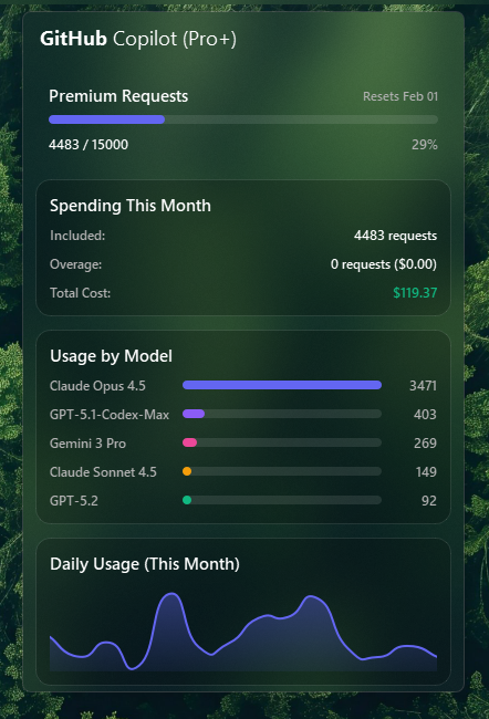
The Copilot widget displays your GitHub Copilot AI credits billing usage with a detailed menu showing statistics, usage breakdown by model, and a daily usage chart.
Note
: This widget requires a GitHub Copilot Pro, Pro+, or Max subscription. The free tier is not supported due to API limitations.
Features#
- AI Credits Tracking: Shows used/allowance in the status bar
- Color-coded Thresholds: Visual warnings when approaching limits
- Detailed Menu:
- Usage progress bar
- Spending breakdown (included, overage, total cost)
- Usage by AI model (Claude, GPT-4, Gemini, etc.)
- Daily usage chart (from start of month)
- Plan Support: Pro (1,500 credits), Pro+ (7,000 credits), Max (20,000 credits) - configurable via
planoption - Automatic Refresh: Configurable update interval
Requirements#
- GitHub Copilot Pro, Pro+, or Max subscription (individual plans)
- Note: Organization-billed subscriptions (such as Copilot Business or Copilot Enterprise) are not supported because their usage metrics are managed at the organization level and cannot be retrieved via personal account endpoints.
Authentication#
The Copilot widget supports three ways to authenticate:
-
OAuth sign-in (recommended) - Leave the
tokenoption empty. When you click the widget it will open a sign-in dialog where you authorize with GitHub through your browser. The token is saved automatically and persists across restarts. -
Fine-grained Personal Access Token - Create one at GitHub Token Settings with the Plan (read) account permission and paste it into the
tokenoption. -
Environment variable - Set
token: envand define theYASB_COPILOT_TOKENenvironment variable with your token.
Token storage#
OAuth tokens are stored in %LOCALAPPDATA%\YASB\github_copilot_token. To sign out, simply delete this file and restart YASB.
Configuration#
copilot:
  type: "yasb.copilot.CopilotWidget"
  options:
    label: "{icon}"
    label_alt: "{used}/{allowance}"
    token: "github_pat_xxxxxxxxxxxx"
    plan: "pro" #Set your plan "pro", "pro_plus" or "max"
    tooltip: true
    update_interval: 120
    icons:
      copilot: "\uf113"
      error: "\uf071"
    thresholds:
      warning: 75
      critical: 90
    menu:
      blur: true
      round_corners: true
      round_corners_type: "normal"
      border_color: "System"
      alignment: "right"
      direction: "down"
      offset_top: 6
      offset_left: 0
      chart: true
Options#
| Option | Type | Default | Description |
|---|---|---|---|
label |
string | "{icon}" |
Label format for the bar. Supports {icon}, {used}, {allowance}, {percentage}, {total_cost}, {additional_usage}, {status}, {reset_date} |
label_alt |
string | "{used}/{allowance}" |
Alternative label (toggle with right-click) |
token |
string | "" |
GitHub token. Leave empty to use OAuth sign-in, or set to "env" to read from YASB_COPILOT_TOKEN env var |
plan |
string | "pro" |
Your Copilot plan: "pro" (1,500 credits), "pro_plus" (7,000 credits) or "max" (20,000 credits) |
tooltip |
boolean | true |
Show tooltip on hover |
update_interval |
integer | 3600 |
Refresh interval in seconds |
icons.copilot |
string | "\uf4b8" |
Icon for Copilot (main widget and empty state) |
icons.error |
string | "\uf4b9" |
Icon for error display |
thresholds.warning |
integer | 75 |
Percentage threshold for warning state |
thresholds.critical |
integer | 90 |
Percentage threshold for critical state |
menu |
dict | see Menu | Popup menu options. chart enables the daily usage chart (set to false to skip daily API calls) |
keybindings |
list | [] |
Optional hotkeys. See Keybindings |
callbacks |
dict | See below | Mouse callbacks, see Callbacks |
Menu#
The menu option controls the popup. All keys are optional, the values below are the defaults.
menu:
  blur: true
  round_corners: true
  round_corners_type: "normal" # "normal" or "small"
  border_color: "System"
  alignment: "right"           # "left", "center" or "right"
  direction: "down"            # "up" or "down"
  offset_top: 6
  offset_left: 0
  chart: true
Callbacks#
| Callback | Description |
|---|---|
toggle_label |
Toggle between main and alt label |
toggle_popup |
Show/hide the detailed menu |
refresh |
Manually refresh data from API |
do_nothing |
Do nothing |
callbacks:
  on_left: "toggle_popup"
  on_middle: "do_nothing"
  on_right: "toggle_label"
Environment Variables#
You can use an environment variable instead of hardcoding your token:
token: "env"
Then set this environment variable:
YASB_COPILOT_TOKEN- Your GitHub fine-grained PAT
Note
: Username is automatically detected from the token. You must set the plan option to match your subscription ("pro", "pro_plus", or "max") as the GitHub API does not provide plan information.
Label Placeholders#
The following placeholders can be used in label and label_alt:
| Placeholder | Description |
|---|---|
{icon} |
The Copilot icon |
{used} |
Number of AI Credits used this month |
{allowance} |
Your monthly credit allowance/limit based on plan |
{percentage} |
Usage percentage |
{total_cost} |
Total cost of credits consumed this month |
{additional_usage} |
Overage credits used beyond your allowance |
{status} |
Connection status (active or inactive) |
{reset_date} |
Cycle reset date (e.g. Jul 01) |
Styling#
Widget Classes#
/* Main widget container */
.copilot-widget {}
.copilot-widget .widget-container {}
.copilot-widget .label {}
.copilot-widget .label.alt {}
.copilot-widget .icon {}

/* Warning/critical states (applied when usage exceeds thresholds) */
.copilot-widget .label.warning {}
.copilot-widget .label.critical {}
.copilot-widget .icon.warning {}
.copilot-widget .icon.critical {}
Menu Classes#
/* Menu container */
.copilot-menu {}

/* Header */
.copilot-menu .header {}

/* Section containers */
.copilot-menu .section {}
.copilot-menu .progress-section {}
.copilot-menu .spending-section {}
.copilot-menu .model-section {}
.copilot-menu .chart-section {}
.copilot-menu .error-section {}
.copilot-menu .section-title {}

/* Progress section */
.copilot-menu .progress-bar {}
.copilot-menu .progress-bar .fill {}
.copilot-menu .progress-bar.warning {}
.copilot-menu .progress-bar.warning .fill {}
.copilot-menu .progress-bar.critical {}
.copilot-menu .progress-bar.critical .fill {}
.copilot-menu .usage-count {}
.copilot-menu .usage-percent {}
.copilot-menu .reset-date {}

/* Spending section */
.copilot-menu .stat-row {}
.copilot-menu .stat-row.total {}
.copilot-menu .stat-label {}
.copilot-menu .stat-value {}

/* Model section - each model gets model-0 to model-4 class */
.copilot-menu .model-usage-row {}
.copilot-menu .model-name {}
.copilot-menu .model-count {}
.copilot-menu .progress-bar.model-0 .fill {}
.copilot-menu .progress-bar.model-1 .fill {}
.copilot-menu .progress-bar.model-2 .fill {}
.copilot-menu .progress-bar.model-3 .fill {}
.copilot-menu .progress-bar.model-4 .fill {}

/* Chart section - use 'color' property for line/fill color */
.copilot-menu .usage-chart {}

/* Error section */
.copilot-menu .error-icon {}
.copilot-menu .error-message {}

/* Empty/loading state */
.copilot-menu .empty-icon {}
.copilot-menu .empty-message {}
Example Styles#
/* Bar widget */
.copilot-widget .icon {
    font-size: 14px;
    padding-right: 1px;
}
.copilot-widget .label.warning,
.copilot-widget .icon.warning {
    color: #f59e0b;
}
.copilot-widget .label.critical,
.copilot-widget .icon.critical {
    color: #ffba44;
}
/* Menu container */
.copilot-menu {
    background: rgba(24, 25, 27, 0.5);
    min-width: 400px;
}

/* Header */
.copilot-menu .header {
    font-size: 18px;
    font-weight: 400;
    font-family: 'Segoe UI';
    padding: 12px 0 12px 12px;
    color: white;
}

/* Section containers */
.copilot-menu .section {
    background-color: rgba(0, 0, 0, 0.2);
    border: 1px solid rgba(255, 255, 255, 0.1);
    border-radius: 14px;
    margin: 6px 12px;
}
.copilot-menu .section.progress-section{
    background-color:transparent;
    border: none
}

.copilot-menu .section-title {
    font-size: 13px;
    font-weight: 600;
    margin-bottom: 12px;
    margin-left: -3px;
    color: #fff;
    font-family: 'Segoe UI';
}
.copilot-menu .section.progress-section .section-title {
    margin-bottom: 0;
    margin-left: 0;
}
/* Progress bar - track (background) */
.copilot-menu .progress-bar {
    background-color: rgba(255, 255, 255, 0.1);
    border-radius: 4px;
}

/* Progress bar - fill (foreground) */
.copilot-menu .progress-bar .fill {
    background-color: #6366f1;
    border-radius: 4px;
}

/* Progress bar states */
.copilot-menu .progress-bar.warning .fill {
    background-color: #f59e0b;
}

.copilot-menu .progress-bar.critical .fill {
    background-color: #ef4444;
}

/* Progress section text */
.copilot-menu .usage-count {
    font-size: 12px;
    color: #b1b1b1;
    font-family: 'Segoe UI';
    font-weight: 600;
}

.copilot-menu .usage-percent {
    font-size: 12px;
    color: #b1b1b1;
    font-family: 'Segoe UI';
    font-weight: 600;
}

.copilot-menu .reset-date {
    font-size: 11px;
    color: #b1b1b1;
    font-family: 'Segoe UI';
    font-weight: 600;
}

/* Spending section */
.copilot-menu .stat-label {
    color: #b1b1b1;
    font-family: 'Segoe UI';
    font-weight: 600;
    font-size: 12px;
}

.copilot-menu .stat-value {
    color: #b1b1b1;
    font-family: 'Segoe UI';
    font-weight: 600;
    font-size: 12px;
}

.copilot-menu .stat-row.total .stat-value {
    font-weight: 600;
    font-family: 'Segoe UI';
    font-size: 12px;
    color: #10b981;
}
/* Model section - different colors for each model */
.copilot-menu .model-name {
    color: #b1b1b1;
    font-weight: 600;
    font-family: 'Segoe UI';
    font-size: 12px;
}

.copilot-menu .model-count {
    color: #b1b1b1;
    font-weight: 600;
    font-family: 'Segoe UI';
    font-size: 12px;
}

.copilot-menu .progress-bar.model-0 .fill {
    background-color: #6366f1;
}

.copilot-menu .progress-bar.model-1 .fill {
    background-color: #8b5cf6;
}

.copilot-menu .progress-bar.model-2 .fill {
    background-color: #ec4899;
}

.copilot-menu .progress-bar.model-3 .fill {
    background-color: #f59e0b;
}

.copilot-menu .progress-bar.model-4 .fill {
    background-color: #10b981;
}

/* Chart - line and fill color controlled by 'color' property */
 .copilot-menu .usage-chart {
    color: #6366f1;
}

/* Error section */
.copilot-menu .error-section {
    background:transparent;
    border: none;
    padding: 32px 0;
}

.copilot-menu .error-icon {
    color: #c0c0c0;
    font-size: 88px;
}

.copilot-menu .error-message {
    color: #c0c0c0;
    font-size: 14px;
    font-weight: 600;
    font-family: 'Segoe UI';
}

/* Empty/loading state */
.copilot-menu .empty-icon {
    padding-top: 32px;
    color: #c0c0c0;
    font-size: 88px;
}

.copilot-menu .empty-message {
    color: #c0c0c0;
    font-size: 14px;
    font-weight: 600;
    font-family: 'Segoe UI';
    padding-bottom: 32px;
}
Preview of the Widget#