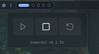
Komorebi Control Widget#
This widget provides a control interface for Komorebi, allowing users to start, stop, and reload the application. It also includes options for running AutoHotKey and WHKD, as well as displaying the Komorebi version.
| Option | Type | Default | Description |
|---|---|---|---|
label |
string | "\udb80\uddd9" |
Icon or text label. |
icons |
dict | {'start': "\uead3", 'stop': "\uead7", 'reload': "\uead2"} |
Button icons. |
run_ahk |
boolean | false |
Whether to run AutoHotKey. |
run_whkd |
boolean | false |
Whether to run WHKD. |
run_masir |
boolean | false |
Whether to run Masir. |
config_path |
string | None |
Path to the Komorebi configuration file. If not set, uses default location. |
show_version |
boolean | true |
Whether to show the komorebi version. |
komorebi_menu |
dict | See below | Settings for the Komorebi menu. |
keybindings |
list | [] |
Optional hotkeys. See Keybindings. |
callbacks |
dict | See below | Callbacks for mouse events. |
Callbacks#
The callbacks option maps mouse buttons (on_left, on_middle, on_right) to actions. All keys are optional, the values shown are the defaults.
callbacks:
  on_left: "toggle_menu"
  on_middle: "do_nothing"
  on_right: "do_nothing"
Available actions:
toggle_menu- Open or close the popup menu.do_nothing- Do nothing.exec <command>- Run a command, for exampleexec cmd.exe /c start ms-settings:network.
Komorebi Menu Options#
The komorebi_menu option accepts the following keys. All keys are optional, the values shown are the defaults.
komorebi_menu:
  blur: true
  round_corners: true
  round_corners_type: "normal"
  border_color: "System"
  alignment: "right"
  direction: "down"
  offset_top: 6
  offset_left: 0
Example Configuration#
  komorebi_control:
      type: "komorebi.control.KomorebiControlWidget"
      options:
        label: "<span>\udb80\uddd9</span>"
        icons:
          start: "\uead3"
          stop: "\uead7"
          reload: "\uead2"
        run_ahk: false
        run_whkd: false
        run_masir: false
        show_version: true
        komorebi_menu:
          blur: true
          round_corners: true
          round_corners_type: 'normal'
          border_color: 'System'
          alignment: 'left'
          direction: 'down'
          offset_top: 6
          offset_left: 0
Description of Options#
- label: Icon or text label.
- icons: Button icons.
- start: Icon for the start button.
- stop: Icon for the stop button.
- reload: Icon for the reload button.
- run_ahk: Whether to run AutoHotKey.
- run_whkd: Whether to run WHKD.
- run_masir: Whether to run Masir.
- config_path: Path to the Komorebi configuration file. If not set, uses the default location. (e.g.,
C:/Users/username/.config/komorebi.json). - show_version: Whether to show the komorebi version.
- komorebi_menu: Settings for the Komorebi menu.
- blur: Whether to enable blur effect.
- round_corners: Whether to round corners.
- round_corners_type: Type of rounding (
normal,small). - border_color: Border color ("System", None, "Hex Color").
- alignment: Alignment of the menu (left, right, center).
- direction: Direction of the menu (up, down).
- offset_top: Top offset for the menu.
- offset_left: Left offset for the menu.
- keybindings: A list of global hotkeys for this widget. See Keybindings.
- callbacks: Mouse event callbacks. See Callbacks.
Widget Style#
.komorebi-control-widget {}
.komorebi-control-widget .widget-container {}
.komorebi-control-widget .widget-container .label {}
.komorebi-control-widget .widget-container .icon {}
/* Komorebi Menu */
.komorebi-control-menu {}
.komorebi-control-menu .button {}
.komorebi-control-menu .button:hover {}
.komorebi-control-menu .button.start {}
.komorebi-control-menu .button.stop {}
.komorebi-control-menu .button.reload {}
.komorebi-control-menu .button.active {}
.komorebi-control-menu .button:disabled {}
.komorebi-control-menu .footer {}
.komorebi-control-menu .footer .text {}
Example Style#
.komorebi-control-widget .label {
    font-size: 14px;
    color: #cdd6f4;
    font-weight: 600;
}
.komorebi-control-menu {
    background-color: rgba(17, 17, 27, 0.2);
}
.komorebi-control-menu .button {
    color: rgba(162, 177, 199, 0.4);
    padding: 8px 16px;
    font-size: 32px;
    border-radius: 8px;
    background-color: rgba(255, 255, 255, 0.04);
}
.komorebi-control-menu .button.active {
    color: rgb(228, 228, 228);
    background-color: rgba(255, 255, 255, 0.04);
}
.komorebi-control-menu .button:disabled,
.komorebi-control-menu .button.active:disabled {
    background-color: rgba(255, 255, 255, 0.01);
    color: rgba(255, 255, 255, 0.2);
}
.komorebi-control-menu .footer .text {
    font-size: 12px;
    color: #6c7086;
}
Preview of the Widget#