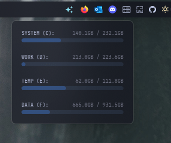
Disk Widget Configuration#
Shows how much storage space you have left on your local drives. You can customize warning thresholds, add circular progress indicators, click to open a drive in File Explorer, and click to show a popup monitoring multiple drives at the same time.
| Option | Type | Default | Description |
|---|---|---|---|
label |
string | '{volume_label} {space[used][percent]}' |
The format string for the disk widget. |
label_alt |
string | '{volume_label} {space[used][gb]} / {space[total][gb]}' |
The alternative format string for the disk widget. |
class_name |
string | "" |
Additional CSS class name for the widget. |
volume_label |
string | 'C' |
Partition which you want to show in the bar |
decimal_display |
integer | 1 |
The number of decimal places to show, default 1 (min 0 max 3) |
update_interval |
integer | 60 |
The interval in seconds to update the disk widget. Must be between 0 and 3600. |
group_label |
dict | See below | Group labels for multiple disks. This will show the labels of multiple disks in a popup window. |
keybindings |
list | [] |
Optional hotkeys. See Keybindings. |
callbacks |
dict | See below | Callbacks for mouse events. |
disk_thresholds |
dict | {'low': 25, 'medium': 50, 'high': 90} |
Thresholds for Disk usage levels. |
progress_bar |
dict | See below | Progress bar settings. |
Callbacks#
The callbacks option maps mouse buttons (on_left, on_middle, on_right) to actions. All keys are optional, the values shown are the defaults.
callbacks:
  on_left: "toggle_label"
  on_middle: "do_nothing"
  on_right: "do_nothing"
Available actions:
toggle_label- Switch betweenlabelandlabel_alt.toggle_group- Open or close the group label popup.update_label- Refresh the label now.do_nothing- Do nothing.exec <command>- Run a command, for exampleexec cmd.exe /c start ms-settings:network.
Group Label Options#
The group_label option accepts the following keys. All keys are optional, the values shown are the defaults.
group_label:
  volume_labels: ["C"]
  show_label_name: true
  blur: true
  round_corners: true
  round_corners_type: "normal"
  border_color: "System"
  alignment: "right"
  direction: "down"
  offset_top: 6
  offset_left: 0
Progress Bar Options#
The progress_bar option accepts the following keys. All keys are optional, the values shown are the defaults.
progress_bar:
  enabled: false
  progress_type: "circular"
  size: 18
  thickness: 3
  radius: 0
  color: "#00C800"
  background_color: "#3C3C3C"
  position: "left"
  animation: true
Example Configuration#
disk:
  type: "yasb.disk.DiskWidget"
  options:
      label: "{volume_label} {space[used][percent]}"
      label_alt: "{volume_label} {space[used][gb]} / {space[total][gb]}"
      volume_label: "C"
      update_interval: 60
      group_label:
        volume_labels: ["C", "D", "E", "F"]
        show_label_name: true
        blur: True
        round_corners: True
        round_corners_type: "small"
        border_color: "System"
        alignment: "right"
        direction: "down"
      callbacks:
        on_left: "toggle_group"
        on_middle: "toggle_label"
        on_right: "exec explorer C:\\" # Open disk C in file explorer
      disk_thresholds:
          low: 25
          medium: 50
          high: 90
Description of Options#
- label: The format string for the disk widget.
- label_alt: The alternative format string for the disk widget.
- class_name: Additional CSS class name for the widget. This allows for custom styling.
- volume_label: Partition/volume which you want to show in the bar.
- decimal_display: The number of decimal places to show, default 1 (min 0 max 3).
- update_interval: The interval in seconds to update the disk widget. Must be between 0 and 3600.
- disk_thresholds: A dictionary specifying the thresholds for disk usage levels. The keys are
low,medium, andhigh, and the values are the percentage thresholds. Based on the current disk usage, a CSS class is applied to the label:status-low,status-medium,status-high, orstatus-critical. - group_label: Group labels for multiple disks. This will show the labels of multiple disks in a popup window.
- volume_labels: List of volume labels to show in the group label.
- show_label_name: Show the label name in the group label.
- blur: Enable blur effect for the group label.
- round_corners: Enable round corners for group label.
- round_corners_type: Border type for group label can be
normalandsmall. Default isnormal. - border_color: Border color for group label can be
None,SystemorHex Color"#ff0000". - alignment: Alignment of the group label. Possible values are
left,center, andright. - direction: Direction of the group label. Possible values are
upanddown. - offset_top: Offset from the top of the screen.
- offset_left: Offset from the left of the screen.
- keybindings: A list of global hotkeys for this widget. See Keybindings.
- callbacks: Mouse event callbacks. See Callbacks.
- progress_bar: A dictionary containing settings for the progress bar. It includes:
- enabled: Whether the progress bar is enabled.
- progress_type: The type of progress bar. Options are
"circular","linear_horizontal", or"linear_vertical". - position: The position of the progress bar, either "left" or "right".
- size: The length of the progress bar (or diameter if circular). Minimum is 1, maximum is 200.
- thickness: The thickness of the progress bar. Minimum is 1, maximum is 100.
- radius: The border radius for the linear progress bar corners. Minimum is 0, maximum is 100.
- color: The color of the progress bar. Color can be a single color or a gradient. For example,
color: "#57948a"orcolor: ["#57948a", "#ff0000"]for a gradient. - background_color: The background color of the progress bar.
- animation: Whether to enable smooth change of the progress bar value.
Label Format Variables#
The following variables can be used in label and label_alt:
| Variable | Description | Example Output |
|---|---|---|
{volume_label} |
The drive letter | C |
{space[total][mb]} |
Total space in MB | 953674.32MB |
{space[total][gb]} |
Total space in GB | 931.51GB |
{space[total][tb]} |
Total space in TB | 0.91TB |
{space[free][mb]} |
Free space in MB | 476837.16MB |
{space[free][gb]} |
Free space in GB | 465.66GB |
{space[free][tb]} |
Free space in TB | 0.45TB |
{space[free][percent]} |
Free space percentage | 50.0% |
{space[used][mb]} |
Used space in MB | 476837.16MB |
{space[used][gb]} |
Used space in GB | 465.85GB |
{space[used][tb]} |
Used space in TB | 0.45TB |
{space[used][percent]} |
Used space percentage | 50.0% |
Disk Threshold Classes#
Based on disk_thresholds configuration, the widget applies CSS classes to style the label based on disk usage:
| Disk Usage | CSS Class Applied |
|---|---|
0% - low |
status-low |
low - medium |
status-medium |
medium - high |
status-high |
Above high |
status-critical |
Widget Style#
.disk-widget {}
.disk-widget.your_class {} /* If you are using class_name option */
.disk-widget .widget-container {}
.disk-widget .widget-container .label {}
.disk-widget .widget-container .label.alt {}
.disk-widget .widget-container .icon {}
/* Threshold status classes */
.disk-widget .widget-container .label.status-low {}
.disk-widget .widget-container .label.status-medium {}
.disk-widget .widget-container .label.status-high {}
.disk-widget .widget-container .label.status-critical {}
/* Group label style */
.disk-group {}
.disk-group-row {}
.disk-group-label {}
.disk-group-label-size {}
.disk-group-label-bar {}
.disk-group-label-bar::chunk {}

/* Disk progress bar styles if enabled */
.disk-widget .progress-container {}
Example Style for Threshold Classes#
.disk-widget .widget-container .label.status-low {
    color: #a6e3a1; /* Green */
}
.disk-widget .widget-container .label.status-medium {
    color: #f9e2af; /* Yellow */
}
.disk-widget .widget-container .label.status-high {
    color: #fab387; /* Orange */
}
.disk-widget .widget-container .label.status-critical {
    color: #f38ba8; /* Red */
}
Example Style for Group Label#
.disk-group {
    background-color:rgba(17, 17, 27, 0.75);
}
.disk-group-row {
    min-width: 220px;
    max-width: 220px;
    max-height: 40px;
    margin: 0;
    padding: 0;
    border-radius: 6px;
    border: 1px solid rgba(128, 128, 128, 0);
}
.disk-group-row:hover {
    background-color:rgba(255, 255, 255, 0.05);
    border: 1px solid rgba(255, 255, 255, 0.1)
}
.disk-group-label-bar{
    max-height:8px;
    border:0px solid rgba(128, 128, 128, 0);
    background-color: rgba(137, 180, 250, 0.1);
    border-radius: 4px
}
.disk-group-label-bar::chunk{
    background-color: rgba(137, 180, 250, 0.3);
    border-radius: 4px
}
.disk-group-label {
    font-size: 10px
}
.disk-group-label-size {
    font-size: 10px;
    color: #585b70
}
Example Settings for Group Label and show menu#
  disk:
    type: "yasb.disk.DiskWidget"
    options:
        label: "<span>\uf473</span>"
        label_alt: "<span>\uf473</span>"
        group_label:
          volume_labels: ["C", "D", "E", "F"]
          show_label_name: true
          blur: True
          round_corners: True
          round_corners_type: "normal"
          border_color: "System"
          alignment: "right"
          direction: "down"
          offset_top: 6
        callbacks:
          on_left: "toggle_group"
Style for Group Label and show menu#
.disk-widget {
    padding: 0 6px 0 6px;
}
.disk-group {
    background-color:rgba(17, 17, 27, 0.4);
}
.disk-group-row {
    min-width: 220px;
    max-width: 220px;
    max-height: 40px;
    margin: 0;
    padding: 0;
    border-radius: 6px;
    border: 1px solid rgba(128, 128, 128, 0);
}
.disk-group-row:hover {
    background-color:rgba(255, 255, 255, 0.05);
    border: 1px solid rgba(255, 255, 255, 0.1);
}
.disk-group-label-bar{
    max-height:8px;
    border:0px solid rgba(128, 128, 128, 0);
    background-color: rgba(137, 180, 250, 0.1);
    border-radius: 4px;
}
.disk-group-label-bar::chunk{
    background-color: rgba(61, 135, 255, 0.3);
    border-radius: 4px;
}
.disk-group-label {
    font-size: 10px;
}
.disk-group-label-size {
    font-size: 10px;
    color: #666879;
}
Preview of the Widget#