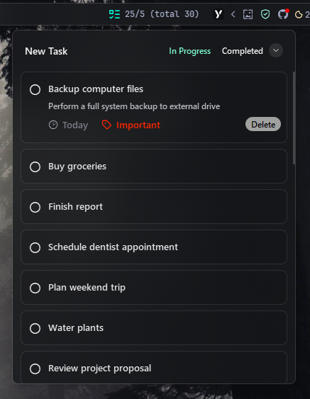
Todo Widget#
The Todo widget provides a simple task management interface directly in your YASB bar. It displays the number of tasks, completed tasks, and allows you to add, check, categorize, and delete tasks. The widget is highly customizable with icons, categories, and menu options. Widget data is stored in a JSON file (todo.json) in the YASB config directory.
| Option | Type | Default | Description |
|---|---|---|---|
label |
string | \uf4a0 {count}/{completed} |
Main label format. Use {count} for active (not completed) tasks, {completed} for completed tasks, {total} for all tasks. |
label_alt |
string | \uf4a0 Tasks: {count} |
Alternative label format. |
data_path |
string | "" |
Custom path to JSON file for storing tasks. Leave empty to use default location (~/.config/yasb/todo.json). Supports ~ for home directory. |
menu |
dict | See below | Popup menu settings. |
icons |
dict | See below | Icons for add, delete, check, etc. |
categories |
dict | default, urgent, important, soon, today |
Task categories and their labels. |
keybindings |
list | [] |
Optional hotkeys. See Keybindings. |
callbacks |
dict | See below | Mouse event callbacks. |
Callbacks#
The callbacks option maps mouse buttons (on_left, on_middle, on_right) to actions. All keys are optional, the values shown are the defaults.
callbacks:
  on_left: "toggle_menu"
  on_middle: "do_nothing"
  on_right: "toggle_label"
Available actions:
toggle_label- Switch betweenlabelandlabel_alt.toggle_menu- Open or close the popup menu.do_nothing- Do nothing.exec <command>- Run a command, for exampleexec cmd.exe /c start ms-settings:network.
Menu Options#
The menu option accepts the following keys. All keys are optional, the values shown are the defaults.
menu:
  blur: true
  round_corners: true
  round_corners_type: "normal"
  border_color: "system"
  alignment: "left"
  direction: "down"
  offset_top: 6
  offset_left: 0
Icons Options#
The icons option accepts the following keys. All keys are optional, the values shown are the defaults.
icons:
  add: "New Task"
  edit: "Edit"
  delete: "Delete"
  date: "\ue641"
  category: "\uf412"
  checked: "\udb80\udd34"
  unchecked: "\udb80\udd30"
  sort: "\ueab4"
  no_tasks: "\uf4a0"
Example Configuration#
todo:
  type: "yasb.todo.TodoWidget"
  options:
    label: "\uf0ae {count}/{completed}"
    label_alt: "\uf0ae Tasks: {count}"
    # data_path: "~/Documents/my-todos.json"  # Optional: custom JSON file path
    menu:
      blur: true
      round_corners: true
      round_corners_type: "normal"
      border_color: "system"
      alignment: "center"
      direction: "down"
      offset_top: 6
      offset_left: 0
    icons:
      add: "\uf501 New Task"
      edit: "Edit"
      delete: "Delete"
      date: "\ue641"
      category: "\uf412"
      checked: "\udb80\udd34"
      unchecked: "\udb80\udd30"
      sort: "\ueab4"
      no_tasks: "\uf4a0"
    categories:
      default:
        label: "General"
      soon:
        label: "Complete soon"
      today:
        label: "End of day"
      urgent:
        label: "Urgent"
      important:
        label: "Important"
    callbacks:
      on_left: "toggle_menu"
      on_middle: "do_nothing"
      on_right: "toggle_label"
Description of Options#
- label: Main label format, supports
{count}for active (not completed) tasks,{completed}for completed tasks, and{total}for all tasks. - label_alt: Alternative label format.
- data_path: Optional custom path to the JSON file where tasks are stored. If empty or not specified, uses the default location (
~/.config/yasb/todo.json). Supports~for home directory expansion (e.g.,~/Documents/my-todos.jsonorC:/Users/YourName/my-todos.json). - menu: Popup menu appearance and behavior:
- blur: Enable blur effect.
- round_corners: Enable rounded corners.
- round_corners_type: "normal" or "small".
- border_color: Border color (
"system", HEX or None). - alignment: Menu alignment ("left", "center", "right").
- direction: Menu opens "up" or "down".
- offset_top: Vertical offset for the menu.
- offset_left: Horizontal offset for the menu.
- icons: Customize icons for actions:
- add: Icon or text for adding tasks button
- edit: Icon or text for editing tasks button
- delete Icon or text for deleting tasks button
- date Icon for date label
- category Icon for category label
- checked: Icon for checked tasks.
- unchecked Icon for unchecked tasks.
- sort: Icon for sorting tasks.
- no_tasks Icon displayed when no tasks are available.
- categories: Define task categories and their labels. By default
default(General),urgent(Urgent),important(Important),soon(Complete soon) andtoday(End of day) are available. - keybindings: A list of global hotkeys for this widget. See Keybindings.
- callbacks: Mouse event callbacks. See Callbacks.
Important
Todo widget uses the QMenu for the context menu, which supports various styles. You can customize the appearance of the menu using CSS styles. For more information on styling, refer to the Context Menu Styling.
If you want to use different styles for the context menu, you can target the .todo-menu .context-menu class to customize the appearance of the Todo widget menu.
Available Styles#
.todo-widget {}
.todo-widget .icon {}
.todo-widget .label {}
/* todo-menu styles */
.todo-menu {}
.todo-menu .header {}
.todo-menu .header .add-task-button {}
.todo-menu .header .tab-buttons {}
.todo-menu .header .tab-buttons.in-progress {}
.todo-menu .header .tab-buttons.completed {}
.todo-menu .header .tab-buttons.in-progress:checked {}
.todo-menu .header .tab-buttons.completed:checked {}
.todo-menu .header .tab-buttons.sort {}
.todo-menu .header .tab-buttons.sort:pressed {}
.todo-menu .header .toggle-tab.in-progress {}
.todo-menu .no-tasks {}
.todo-menu .no-tasks-icon {}
/* todo-menu task item styles */
.todo-menu .task-item {}
.todo-menu .task-item.expanded {}
/* todo-menu task item styles based on category */
.todo-menu .task-item.important {}
.todo-menu .task-item.urgent {}
.todo-menu .task-item.soon {}
.todo-menu .task-item.today {}
.todo-menu .task-item.default {}

.todo-menu .task-item.drop-highlight {}
.todo-menu .task-item.drop-highlight:hover {}
.todo-menu .task-item.drop-highlight:focus {}
.todo-menu .task-item .title {}
.todo-menu .task-item.completed .title {}
.todo-menu .task-item.completed .description {}
.todo-menu .task-item .description {}
.todo-menu .task-checkbox {}
.todo-menu .task-checkbox:checked {}
.todo-menu .task-info-row {}
.todo-menu .task-info-row .date-text {}
.todo-menu .task-info-row .category-text {}
.todo-menu .task-info-row .date-icon {}
.todo-menu .task-info-row .category-icon {}
.todo-menu .task-info-row .category-text.important {}
.todo-menu .task-info-row .category-icon.important {}
.todo-menu .task-info-row .category-text.urgent {}
.todo-menu .task-info-row .category-icon.urgent {}
.todo-menu .task-info-row .category-text.soon {}
.todo-menu .task-info-row .category-icon.soon {}
.todo-menu .task-info-row .category-text.today {}
.todo-menu .task-info-row .category-icon.today {}
.todo-menu .task-info-row .edit-task-button {}
.todo-menu .task-info-row .delete-task-button {}
/* todo-menu dialog styles */
.todo-menu .app-dialog {}
.todo-menu .app-dialog .category-container {}
.todo-menu .app-dialog .buttons-container {}
.todo-menu .app-dialog .title-field {}
.todo-menu .app-dialog .desc-field {}
.todo-menu .app-dialog .title-field:focus {}
.todo-menu .app-dialog .desc-field:focus {}
.todo-menu .app-dialog .buttons-container .button {}
.todo-menu .app-dialog .button {}
.todo-menu .app-dialog .button:pressed {}
.todo-menu .app-dialog .button.add {}
.todo-menu .app-dialog .button.add:pressed {}
.todo-menu .app-dialog .button.cancel {}
.todo-menu .app-dialog .warning-message {}
.todo-menu .app-dialog .category-button {}
.todo-menu .app-dialog .category-button.urgent {}
.todo-menu .app-dialog .category-button.soon {}
.todo-menu .app-dialog .category-button.today {}
.todo-menu .app-dialog .category-button.important {}
.todo-menu .app-dialog .category-button:checked {}
Example Styles#
/* Todo Widget Styles */
.todo-widget {
    padding: 0 6px 0 6px;
}
.todo-widget .icon {
    color: #00f8d7;
    padding: 0;
}
.todo-widget .label {
    font-size: 12px;
    padding: 0;
}
/* Todo Menu Styles */
.todo-menu {
    background-color: rgba(24, 25, 27, 0.8);
    min-width: 400px;
    max-width: 400px;
    min-height: 500px;
    max-height: 500px;
}
.todo-menu .header {
    margin: 16px 10px
}
.todo-menu .header .add-task-button,
.todo-menu .header .tab-buttons {
    border: none;
    border-radius: 13px;
    color: #ffffff;
    padding: 4px 8px;
    font-size: 14px;
    font-weight: 600;
    margin: 0px;
    font-family: 'Segoe UI', 'JetBrainsMono NFP';
}
.todo-menu .header .tab-buttons {
    margin: 0;
    font-size: 12px;
}
.todo-menu .header .add-task-button:hover {
    background-color: #0f91e7;
}
.todo-menu .header .tab-buttons.in-progress,
.todo-menu .header .tab-buttons.completed {
    background-color: transparent;
}
.todo-menu .header .tab-buttons.in-progress:checked {
    color: #7fffd4;
}
.todo-menu .header .tab-buttons.completed:checked {
    color: #ff583b;
}
.todo-menu .header .tab-buttons.sort {
    background-color: rgba(255, 255, 255, 0.1);
    color: #ffffff;
    border-radius: 10px;
    min-height: 20px;
    min-width: 20px;
    max-width: 20px;
    max-height: 20px;
    padding: 0;
    margin: 0 8px 0 0;
    font-family: 'JetBrainsMono NFP';
}
.todo-menu .header .tab-buttons.sort:pressed {
    background-color: rgba(255, 255, 255, 0.2);
}
.todo-menu .no-tasks {
    font-family: 'Segoe UI';
    font-size: 18px;
    color: #979fa0;
    font-weight: 400;
    margin-top: 16px;
}
.todo-menu .no-tasks-icon {
    font-size: 80px;
    color: #979fa0;
    font-family: "JetBrainsMono NFP";
    margin-top: 64px;
    font-weight: 400;
}

/* Task item styles */
.todo-menu .task-item {
    background-color: rgba(0, 0, 0, 0.1);
    border-radius: 8px;
    margin: 0px 12px 8px 12px;
    border: 1px solid rgba(255, 255, 255, 0.1);
    padding: 8px 0;
}
.todo-menu .task-item.expanded {
    background-color: rgba(211, 214, 219, 0.1);
    border: 1px solid rgba(255, 255, 255, 0.2);
}
.todo-menu .task-item.drop-highlight,
.todo-menu .task-item.drop-highlight:hover,
.todo-menu .task-item.drop-highlight:focus {
    background-color: rgba(0, 120, 212, 0.26);
    border: 1px solid #007acc;
}
.todo-menu .task-item .title {
    color: #ebebeb;
    font-size: 13px;
    font-weight: 600;
    font-family: 'Segoe UI';
    padding: 0 8px 8px 8px;
    margin-top: 6px;
}
.todo-menu .task-item.completed .title,
.todo-menu .task-item.completed .description {
    text-decoration: line-through;
    color: #7f8c8d;
}
.todo-menu .task-item .description {
    color: #bdc3c7;
    font-size: 12px;
    font-weight: 600;
    padding: 0 8px 8px 8px;
    font-family: 'Segoe UI';
}
.todo-menu .task-checkbox {
    background-color: transparent;
    border: none;
    margin-left: 12px;
    margin-top: 5px;
    font-size: 18px;
    color: #ebebeb;
    font-family: 'JetBrainsMono NFP';
}
.todo-menu .task-checkbox:checked {
    color: #7f8c8d;
}

/* Task info row styles */
.todo-menu .task-info-row {
    margin-left: 8px;
    margin-bottom: 8px;
}
.todo-menu .task-info-row .date-text,
.todo-menu .task-info-row .category-text {
    font-family: 'Segoe UI';
    font-weight: 600;
    color: #7e7f88;
    font-size: 13px;
    padding-left: 0px;
    margin-right: 12px;
}
.todo-menu .task-info-row .date-icon,
.todo-menu .task-info-row .category-icon {
    font-weight: 400;
    color: #a7a8b3;
    font-size: 14px;
    font-family: 'JetBrainsMono NFP';
    margin-top: 1px;
}
.todo-menu .task-info-row .category-text.important,
.todo-menu .task-info-row .category-icon.important {
    color: #ff2600;
}
.todo-menu .task-info-row .category-text.urgent,
.todo-menu .task-info-row .category-icon.urgent {
    color: #ff583b;
}
.todo-menu .task-info-row .category-text.soon,
.todo-menu .task-info-row .category-icon.soon {
    color: #7fffd4;
}
.todo-menu .task-info-row .category-text.today,
.todo-menu .task-info-row .category-icon.today {
    color: #f9e2af;
}
.todo-menu .task-info-row .delete-task-button {
    background-color: rgb(160, 160, 160);
    color: #000000;
    font-family: 'Segoe UI';
    font-weight: 600;
    font-size: 12px;
    padding: 0 8px;
    border-radius: 10px;
    min-height: 20px;
    max-height: 20px;
    margin-right: 8px;
}

/* App dialog style */
.todo-menu .app-dialog {
    font-family: 'Segoe UI';
    background-color: #202020;
}
.todo-menu .app-dialog .buttons-container {
    background-color: #171717;
    margin-top: 16px;
    border-top: 1px solid #000;
    max-height: 80px;
    min-height: 80px;
    padding: 0 20px 0 20px;
}

.todo-menu .app-dialog .title-field,
.todo-menu .app-dialog .desc-field {
    background-color: #181818;
    border: 1px solid #303030;
    border-radius: 4px;
    padding: 0 6px;
    font-family: 'Segoe UI';
    font-size: 12px;
    font-weight: 600;
    color: #FFFFFF;
    margin: 10px 0px 5px 0;
    min-height: 30px;
}
.todo-menu .app-dialog .desc-field {
    max-height: 60px;
}
.todo-menu .app-dialog .title-field:focus,
.todo-menu .app-dialog .desc-field:focus {
    border-bottom-color: #4cc2ff;
}
.todo-menu .app-dialog .button {
    background-color: #2d2d2d;
    border: none;
    border-radius: 4px;
    font-family: 'Segoe UI';
    font-size: 12px;
    font-weight: 600;
    color: #FFFFFF;
    min-width: 80px;
    padding: 0 6px;
    margin: 10px 0 5px 6px;
    min-height: 28px;
    outline: none;
}
.todo-menu .app-dialog .buttons-container .button {
    margin: 10px 0 5px 0px;
    font-size: 13px;
}
.todo-menu .app-dialog .button:focus {
    border: 2px solid #adadad;
}
.todo-menu .app-dialog .button:focus,
.todo-menu .app-dialog .button:hover {
    background-color: #4A4A4A;
}
.todo-menu .app-dialog .button:pressed {
    background-color: #3A3A3A;
}
.todo-menu .app-dialog .button.add {
    background-color: #0078D4;
}
.todo-menu .app-dialog .button.add:focus,
.todo-menu .app-dialog .button.add:hover {
    background-color: #0066B2;
}
.todo-menu .app-dialog .button.add:pressed {
    background-color: #00509E;
}
.todo-menu .app-dialog .warning-message {
    background-color: #2b0b0e;
    border: 1px solid #5a303c;
    border-radius: 4px;
    color: #cc9b9f;
    font-family: 'Segoe UI';
    font-size: 12px;
    font-weight: 600;
    padding: 8px 12px;
    margin: 4px 0px;
}
.todo-menu .app-dialog .category-button {
    background-color: #2d2d2d;
    border: none;
    border-radius: 4px;
    font-family: 'Segoe UI';
    font-size: 11px;
    font-weight: 700;
    color: #afafaf;
    padding: 0 6px;
    margin-top: 8px;
    min-height: 24px;
    outline: none;
}
.todo-menu .app-dialog .category-button:checked {
    background-color: #535353;
    color: #ffffff;
}
Preview of the Widget#