Power Plan Widget#
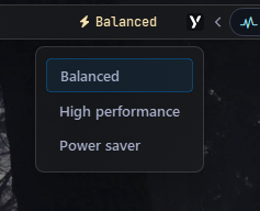
Displays the name of the current Windows power plan and lets you switch between plans via a popup menu.
Options#
| Option | Type | Default | Description |
|---|---|---|---|
label |
string | "\uf0e7 {active_plan}" |
Main label template. Use {active_plan} to insert the active plan name. |
label_alt |
string | "\uf0e7 Power Plan" |
Alternate label (e.g. an icon) shown when toggled via toggle_label. |
class_name |
string | "" |
Additional CSS class name for the widget. |
class_map |
dict | {} |
Optional dictionary mapping localized/custom plan names or GUIDs to pure-ASCII CSS class names. |
menu |
dict | See below | Popup menu options. |
keybindings |
list | [] |
Optional hotkeys. See Keybindings. |
callbacks |
dict | See below | Click handlers: on_left, on_middle, on_right. |
Menu Options#
| Option | Type | Default | Description |
|---|---|---|---|
blur |
bool | true |
Blur background behind the popup. |
round_corners |
bool | true |
Enable rounded corners on the popup. |
round_corners_type |
string | "normal" |
Rounding style: "small", "normal". |
border_color |
string | "system" |
Border color can be None, system or Hex Color "#ff0000" |
alignment |
string | "right" |
Horizontal alignment of the menu relative to the widget (e.g., left, right, center) |
direction |
string | "down" |
Vertical opening direction: "up" or "down". |
offset_top |
int | 6 |
Vertical offset in pixels. |
offset_left |
int | 0 |
Horizontal offset in pixels. |
Example Configuration#
power_plan:
  type: "yasb.power_plan.PowerPlanWidget"
  options:
    label: "<span>\uf0e7</span> {active_plan}"
    label_alt: "<span>\uf0e7</span> Power Plan {active_plan}"
    menu:
      blur: true
      round_corners: true
      round_corners_type: "normal"
      border_color: "system"
      alignment: "center"
      direction: "down"
      offset_top: 6
      offset_left: 0
    callbacks:
      on_left: "toggle_menu"
      on_middle: "do_nothing"
      on_right: "toggle_label"
Description of Options#
- label: Main label template. Use
{active_plan}to insert the active plan name. - label_alt: Alternate label (e.g. an icon) shown when toggled via
toggle_label. - class_name: Additional CSS class name for the widget. This allows for custom styling.
- class_map: Optional dictionary mapping localized or custom power plan names (or GUIDs) to custom pure-ASCII CSS class names. This is extremely useful on localized Windows versions or when styling custom plans.
- menu: Popup menu options.
- keybindings: A list of global hotkeys for this widget. See Keybindings.
- callbacks: Mouse event callbacks. See Callbacks.
Available Callbacks#
The callbacks option maps mouse buttons (on_left, on_middle, on_right) to actions. All keys are optional, the values shown are the defaults.
callbacks:
  on_left: "toggle_menu"
  on_middle: "toggle_label"
  on_right: "do_nothing"
Available actions:
toggle_label: Toggles the visibility of the label.toggle_menu: Toggles the visibility of the power plan menu popup.
Available Styles#
.power-plan-widget {}
.power-plan-widget.your_class {} /* If you are using class_name option */
.power-plan-widget .widget-container {}
.power-plan-widget .label {}
.power-plan-widget .icon {}
.power-plan-menu {}
.power-plan-menu .menu-content {}
.power-plan-menu .menu-content .button {}
Note
To style the label and icon with different colors for each power plan, the widget resolves the active plan's CSS class using the plan's name (with spaces replaced by hyphens and lowercased).
On standard English Windows installations, the default power plans naturally resolve to these predefined classes:
- .balanced (for Balanced)
- .high-performance (for High Performance)
- .power-saver (for Power Saver)
- .ultimate-performance (for Ultimate Performance, a premium/hidden plan)
If you are using a localized version of Windows (e.g., Polish, where the balanced plan is named Zrównoważony) or want to customize your CSS classes, you can use the class_map option to map them back to these standard predefined classes.
Example Configuration for Localized Windows:
yaml
power_plan:
  type: "yasb.power_plan.PowerPlanWidget"
  options:
    class_map:
      "Zrównoważony": "pl-balanced"
      "Wysoka wydajność": "pl-performance"
      "Oszczędzanie energii": "pl-saver"
      "Najwyższa wydajność": "pl-ultimate"
Example Style#
.power-plan-widget {
    padding: 0 6px 0 6px;
}
.power-plan-widget .label {
    font-size: 12px;
}
.power-plan-widget .icon {
    font-size: 12px;
}

.power-plan-menu {
    background-color: rgba(24, 25, 27, 0.6);
}
.power-plan-widget .icon {
    padding-right: 4px;
}
.power-plan-widget .icon.balanced,
.power-plan-widget .label.balanced {
    color: #f9e2af;
}
.power-plan-widget .icon.high-performance,
.power-plan-widget .label.high-performance {
    color: #f38ba8;
}
.power-plan-widget .icon.power-saver,
.power-plan-widget .label.power-saver {
    color: #89b4fa;
}

/* Menu Style */
.power-plan-menu .menu-content {
    margin: 10px;
}
.power-plan-menu .menu-content .button {
    background-color: transparent;
    font-weight: 600;
    font-size: 13px;
    font-family: 'Segoe UI';
    padding: 6px 12px;
    margin: 1px 0;
    border: none;
    border-radius: 4px;
    text-align: left;
}
.power-plan-menu .menu-content  .button:hover {
    background-color: rgba(255, 255, 255, 0.05);
}
.power-plan-menu .menu-content .button.active {
    background-color: rgba(0, 120, 212, 0.1);
    border: 1px solid rgba(0, 120, 212, 0.4);
}
Preview of the Widget#